Thank you for joining me. I’ve been an internet fanboy of yours for a little while but other people in the class don’t know who you are. So if you could say who you are and what you do…?
Noooooo
OK, start on what you’re doing this year then, internetland…
No, I didn’t mean to be rude, I can do that. Could you give me a frame for this a little bit? So I can be as useful as I can? tell me a little more about the class and the context of this video.
This is for HTML Output at RISD here in Providence. It’s in the graphic design department taught by John Caserta and the way he presented the class is that we’re doing experimental web design, experimenting with what the browser can do and what the browser is as a tool.
That’s rad. That sounds super cool.
It’s very open ended and a lot of it is just taking things from formal graphic design and implementing them in the browser, as well as a few browser-specific areas. For the browser, both its output and input is dynamic—and there are glitches or things that are unique to different browsers across different systems. That’s all stuff we’re researching through making.
Is this class available to all majors?
It is! I’m not even at RISD. I’m a math major at Brown.
Rad. Can I see stuff from the class?
Yeah, absolutely. I’ll send you a link in the little chat box here.
You probably already sent it to me, sorry.
No worries. That’s the URL.
OK so a couple months ago I was a guest speaker at a user interface class at, I think The New School, and I gave a summary of my work in the form of a “history of interfaces.” So I showed examples, a chronological view of my portfolio; I only showed the interfaces of a particular project. So I’m Ben [laughs]. I’m a designer. I was supposed to have graduated from MassArt in 2004 and I’ve mostly worked as an independent designer since then. I had a small studio for a handful of years with two other guys. One developer and one other designer and we did websites and logos and that was called “Fwis”.
That’s when I first found your web presence, through readymech.
Oh really! Cool, that’s old.
Buncha years ago
Readymech is from my college years, part of my senior thesis. Actually that’s not true. My senior thesis was sci-fi book covers. Readymech was work on my portfolio. Anyway that was 2004. And then I worked on a couple object jobs to keep bills paid. Tried to work with fwis but never could. I have a really big problem working for people. I just don’t like it at all. I get depressed after 6 months so I’ve learned just to not do that. One of the projects I have launched was called SVPPLY. It was a retail bookmarking service. An image bookmarking service but the brand was retail. That was really interesting; it was my first start-up but I didn’t know it was a startup at the time. And then we took venture capital funding for that and I learned a lot about investors and money and that kinda thing. I left SVPPLY around the time it got bought by ebay in 2012 and I’ve been an independent designer since then. Now I do branding and product design for early startups; doing interface design and I do a lot of company naming and logos. And the interface and a lot of general product strategy—what does the product actually do, and a lot of project therapy.
How the product interacts with its visual language?
No: these founders, the people who start the companies, are usually doing it with someone else and they have a vision for where they want their product to take them but they don’t necessarily know how to get there. They have a lot of ideas but product therapy just means listening to them. Figuring out what they’re actually saying, reducing that down to a series of buttons.
OK.
There’s just a lot of interpersonal skills. It’s just funny because people are crazy about what they want. So that’s what I do up until now! Now I just started this thing internetland. That’s my studio now.
I really want to hear about that. So I know you started the project at the end of last year right? This yearlong shindig?
[Laughs] we’ll see about that year thing.
I want to hear you define it. I know it by name, Internetland v. Print. You’ve done so much work with the web and digital product so where’s the print side coming from?
I made an agreement with myself when left SVPPLY. SVPPLY was really tough; I was CEO of SVPPLY and the designer and I have all these expectations for how to do and I did really badly with a lot of the things that I was supposed to be good at; in large part because of the things that I failed at it wound up having to be sold to ebay. So when i left SVPPLY I made an agreement with myself “I will not bring in any partners, I will not bring in any clients bigger than what I can handle on my own. I won’t hire anybody”. And then also acknowledging that I shouldn’t be doing any work that I didnn’t want to do. I just HATED doing all the CEO stuff—handling all this money and board meetings and laying out agendas for a team. I was convinced that I should be able to do it and I hated it. I spent all of this time just doing something I hated. So I decided I’m not doing that anymore. Not only did I fail but I was miserable. Once I left SVPPLY I reduced everything down to a very small career. I’ve been trying to get my career to the point where I’m only doing things that are interesting. So internetland has emerged from this notion that I can only I’m trying to do more. as I get more focused on what is interesting to myself, its more and more close to art. So internetland was supposed to be an overarching plot that I’m inspired by the internet and I love the internet as a concept this notion of world connection is something that as a designer I can feel good about contributing to. I work more in Adobe Illustrator than anytihng else. I can draw kinda. I can’t paint. I can barely work with my hands. But in Illustrator I feel very loose. It is really my native medium. I’m acknowledging that that’s OK. So I’m trying to embrace digital, vectors, the internet, embrace this embrace towards becoming an artist. Internetland became that. I had tried to raise some money. So I’m doing this project called varsity bookmarking, a magazine, and lookwork, an rss reader, and a couple things I’m working on and they’re under the internetland banner. And I had tried to raise some money and that was really hard I just didn’t enjoy it at all. Trying to raise some money for this art show I want to do. [laughs] I’m talking a lot. The print thing works into all this. Internetland is now my digital direction. It’s me trying to get very smart about how I do work. And the print part. I don’t know. It’s not going to be whats you’re expecting. I’ve stumbled onto this technique of taking magazines/books apart and on the output of that what I believe to be artwork. [Laughs] And it’s print. Like I’m working with old magazines. And I have a lot of these pieces now. And at the show they tie into my digital work in some interesting ways.
OK
yeah I mean there’s… you have to understand. like I can try to explain the work but it’s going to be me talking a bunch more.
You don’t have to explain the work, but I am curious about your process on the work. I mean if are these like collages of the magazines or digital manipulations of their content? And then you said that it informs your digital work? Or can come from your digital work? I’m curious what that looks like. Is it something are these forms you’re making in both digital and print? Or some and translating to the other?
I’m gonna try to think about your class for a second. It’s browser based?
It’s browser based, but our end goal for the class is to have a book. So we’re talking a lot about process of going from browser to printed page. Uhm. Like for a kinda homework assignment a few weeks ago was bring in a bunch of tabloid-sized prints that are straight “you’re in safari, seeing a page you hit print and see what comes out”. And seeing what comes out the way it looks on the screen and what doesn’t and just as a conversation about why that happens. Color is especially something we’re talking about.
I just want this to be interesting. Let me try to speak relevantly to some of the things you just said. I guess when it comes to internet and I think of print and I think of digital and browsers mostly I think about how print is dead and how as screens get better and better we’re just going to… books are gonna be around for a long time and they’ll be beautiful and they’ll have their own advantages, but screens are going to get more interesting for a while. The thing that really sold me is the retina display. It’s so nice to having your own work on an iPad that it approaches having painted something. It’s so vibrant and so crisp that my suspicion is that it contributes to digital artists embracing the screen as its own medium. When I’m doing internetland it’s fun to think about things native to the internet. I only work in RGB space. The colors I love most are the ones that can’t exist in CMYK. If you have that color space like drawn around each other. Pure RGB.
I know what you mean. Fill up the red channel. Nothing in the other two. CMYK can’t do that.
With the saturation blown all the way up, you just can’t replicate that in print so that’s very interesting. At least for me. All the work I’m doing now is like I’m trying to do this thing where it looks good on both phone and desktop without changing anything. The scrolls I did for IvP are these giant things you have to scroll through them no matter how big your screen is. Ideally you’re looking at them fullscreen on both phone and desktop so that the colors always blow out. The point with me for scrolls is there are opportunities unique to digital you can’t do in print. Exploring those is there the more interesting things are happening. New, completely new. It’s our turn to do some new stuff.
It couldn’t exist until these uh, retina displays. Makes the color more material, that’s how I feel.
Yeah, it’s like
But a truly native
It’s like I didn’t have that before and now it’s like “eh” and inversely what’s interesting to me about print is that... well, if you go to pieratt.com and scroll down there are examples of the print pieces there. I just don’t really call them out as such. It’s a bunch of spreads. Digital has become so advanced and typical that it feels like art. I can put this magazine piece on a wall now, and even six years ago I wouldn’t have thought it was beautiful but now the patina of the shitty paper feels like something legitimate. It has a character to it that is somewhere for display. For that reason the artwork I’m doing you can see these examples. If I did screenshare would you see them?
Is that how you pronounce your last name? Pieratt?
Pieratt I actually don’t care how you say it.
I’m looking at them now
So the the thought there is that old stuff now looks cool.
yeah or that
Print is dead so print is art. That’s what’s driving the project.
Or now that you’re developing in a purely digital environment the prints gain a certain quality.
I got really lucky. I feel as though I’m doing these magazine pieces and they involved taking magazines apart and there’s a lot of output. The thing that’s somewhere between… what might be interesting. The thing. The thing that interests me most is taking huge amounts of noise and filtering them down into outputs that are beautiful. SVPPLY was a really harvest. Harvesting of an emotion of want. Like “I want that thing”. And now there’s a place to put that. Through some basic code, which is stuck on to a person’s brain through the brain. This brand represents want. Every time you want something, click this bookmark to put it over here. That was our first experiment, when I realized this notion of building design that takes chaos into account and then tries to use best practices with it to make something great. With SVPPLY the thing I was most proud of is that no matter who signed up, within the moment of having a profile, you’d have the most attractive profile that you had anywhere anywhere. Anyone on svpply looks good. That was something with having good whitespace, which at the time was pretty cool. Now with varsity bookmarking, this interview project, we want to imagine if I took a .jpg answer and I embedded that in the page or a youtube answer and you have rich media interviews. Just through someone having answered with links. And that’s what I’m building. And that’s just through answering the right questions. Anyone will be able to take the interview. And at the end of the interview they’ll have their output that makes them look really cool and smart and interesting. All of this design has to fail gracefully; you have to assume some stuff isn’t going to go in right and text isn’t going to go in there. You have to design so that it… well, I’m repeating myself.
For the purposes of our class hearing these thoughts is relevant and hearing about your process for thinking about the print is relevant. OK, I’ll talk about myself a little bit now, I’m a math major and I’m interested in chaos in a formal math sense so I’ve been playing a lot with random generation in the browser. And it starts with literally using javascript to generate random numbers to assign random values to properties of shapes and text and eventually I’d like that randomness to be meaningful. Take it from a datastream somewhere. But I’m really enjoying the process of playing with how much control can you give to the system and still kind of get something meaningful or at least aesthetically nice out of it.
Uh-huh.
It’s a lot about playing with rules. How many rules do you give to your system and then you allow the system to go? And produce that output?
Right.
And the browser itself works really well for this. It’s a constrained environment. How much HTML programming is just hacks that look pretty good all together? So it’s setting rulesets. I’m rambling. I’m really interested in that.
That’s cool to me. I would suggest the rulesets in the scenarios I’m building up well the rulesets are questions, so you just find what is allowable simply by the question and narrow down. Rules you’re applying to the screen, expressed in the form of a question. One of the questions on VB has been “what have you watched repeatedly?” so it’s trying to be more interesting and less linear than “what’s your favorite movie” I’d love to have answers as GIFS or youtube videos or links to IMDB. I don’t really care but when someone asks for a favorite.
They have a running list.
Yeah, like a cache. They pull from a generic cache of an answer. It’s identifiable with who I am. We’ve all seen high fidelity. [Laughs] Anyways I’m trying to decide: in theory you’ll in fact remember what you love just by having watched it many times. But then that couples out with the other questions like what are you listening to right now.
You’re kind of channeling…
Channeling their experience through shared rulesets… yeah.
Does that echo any in your print work? Are there rules you’re working in there or have established for those pieces?
The way it works is half of all printed materials, anything bound… is either a signature binding or a perfect binding. As far as I understand; I’m exaggerating. A lot of things are just glued.
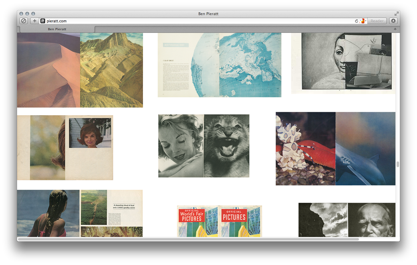
And then glue it together.
You’ve got your perfect binding. Other people use broadsheets. Life magazine is one big broadsheet and you stitch down the middle and then fold it. When you do the signature binding you have to rearrange the content into a new position via a process called imposition: you put page number 2 as the same sheet as page number 98 if in a 100 page book. Lots of magazines, especially older ones, and lots of books, historically and currently work around the signature binding basis. When I realized this I was doing some collage work, somewhat physical, I don’t want to lose all my hand skills. Anyway I reduced the process to: you open up the signature and you go through the spreads as full spreads! and every once in a while you wind up with these juxtapositions never meant to be seem but they share the same physical space and speak into each other in a new truth in a “whoah that’s amazing they’re beautiful, interesting, funny”. The screenshot on pieratt.com is following some examples of output. But follow to my garage that’s got a big stack of output I call my exhaust all the pages from the books. The history of print, really.
Where are these materials coming from?
What’s great is I live in northern New England and there’s antique stores everywhere and this massive market up the road from me, so I get stacks of Life magazine at a time for $10 and tons of books. There’s a $1 book room down the road with giant art books. I live in the perfect area for it. I’m slowly going through it. I haven’t framed anything but some of the work is beautiful. So in that sense you’re going through like I’m not inventing anything new it’s all found objects, but it is the curatorial eye. There is a level of selection involved which is the same thing that grew SVPPLY which is or book cover archive as well. Honestly I’ve never really understood the role this type of curation plays in my own work but I do know I’m picking out really good work that takes certain levels of… there’s plenty of spreads in the print stuff that are attractive, they look good. But there’s very few of them that really speak and say something to me. And I think it’s harder to identify those to some degree. Anyway with SVPPLY the front page, I controlled the front page for the first year. Nothing would go on the front page, which was important for building the brand the site was supposed to appeal to. One of the problems of SVPPLY is that I actually hated shopping; the whole team hated shopping. There were 8 guys on the team and none of us liked shopping. That’s really a problem when you’re building a product and you don’t like using it; you don’t learn anything from it. It can’t speak to you because you’re not trying; you’re not enjoying it. So that was one of the problems… we didn’t know how to grow.
That’s great. I think the your role in your print process is the curatorial eye and the establishing of the process. That’s really what I mean by you set a rule set, you’re buying from this market, you’re looking at the spreads and then you see what comes from it. I think that’s awesome. So you said you’re hoping it still happens? you’re on track?
I mean when I first landed on this print physical art stuff i just flipped my lid like it was so exciting. It’s exhilarating, like I invented my own personal tumblr out of this print. And to me the output is beautiful and it will also make me money eventually and I also enjoy doing it. So it’s just the perfect storm of awesomeness. And I notice these similarities in my web. The thing about VB is that it’s going to be open; I’m calling it a magazine but it behaves like a social network.
Mmm
And it will be the first social network that you can go through linearly, that encourages you to go through user 1 to user 10,000 in a line. And because of that there were some interesting interface opportunities. I can just screenshare… there were some cool interface opportunities of putting two people next to each other that had no goal in being next to each other and then letting their tastes speak to the output of how the interface looked.
How many are on there now? 3?
Just 5. But I’ve been redoing it for a year now, almost a year. I’ve not expected it to take this long, it’s pretty frustrating. But I think it’s going to a good spot. If I can find the file I will show it to you.
[Laughs] Okay.
Wow good stuff. Uhm. Sorry, watching me browse my computer is thrilling. Give me a question or something
I’ve a question. John Caserta, the professor for the class, said “oh you should talk to him about if...” so you said Illustrator is your native tool but you’ve been working in the web for a while. How has browser evolution affected your work?
It was interesting when I was at SVPPLY 2004-2010. 6 years I worked really hard I was really into design. I hated working for people so there was always a lot of hunger, I worked really hard, and then SVPPLY hit and we got funded and then I slowed down a bunch and I had a lot of responsibilities that weren’t design related. For about two years I was distracted both by questions about where the product is going but also just because I had so many other things to do that weren’t design. When I went back to design in 2012 at the end of it I looked around and realized that I had I got back into freelance fine and looked at the work, which is a year and change old, and the work was not good. It was OK—I was still an OK designer but it didn’t look contemporary. It didn’t look like it was at the forefront. I had lost my style or something like that. It was interesting and it was depressing and it was a little bit scary. But I worked through it and over time I’ve redeveloped a strong style for myself. Style to me is output of your own interests. So don’t be afraid of having a style because it’s an expression of what are the components of what you’re working on you find interesting. And to do that you exaggerate them, you focus on them, and then you get like all this stuff that hasn’t really been there before. The time I was at SVPPLY well, that’s when responsive hit. But with responsive your website has to look good on mobile. Tt’s hard to get your head around that to the point you feel creative with it. The limitations that it presents and the opportunities that it presents… You have to have done a good handful of sites before you start to feel comfortable messing with the formulas for it at all, the formulas that have been established. Anyways, knowing that I wanted to stay contemporary and relevant and be excited about my own work I had to get good at mobile. And although I don’t like the app store at all… well I mean I [laughs] use the app store. I need it for apps somewhat but I don’t like it because it’s a closed system. I love the internet, I love the web, but I don’t like the app store because it’s filtered through Apple’s editorial . It’s crazy. I don’t think something can grow naturally on the app store. So I’m not interested in doing apps but websites have to look good on the web. So what that’s meant is that everything gets really big and everything becomes one column. And the moment you break something into two columns it looks old. That’s what I have discovered in my own experience.

That resonates with me to some extent. it’s instantly harkens back to the limits of the page, and the page is old.
If you want your thing to look new make it one column and make it big. There’s a lot of refinement to go on that, moving in that direction. And this whole embrace of RGB… SVPPLY gave me my mission in life. It made me aware of what design could achieve like SVPPLY was a design experiment. I didn’t even like shopping; it was a market experience going through the mechanics of how ffffound used to work and apply it to retail and make it into an exclusive brand and what would you get? I suspected what we would get and I was kinda right. But what it taught me is that with a good idea and some insight… I was a designer now being charged by investors with disrupting a 50 billion, whatever it was, trillion-dollar market of shopping and retail. We were like “oh we’ll be the next 5th avenue, of the internet” and just having those conversations gave me a lot of interest in what the internet was capable of and liable as an individual.
I think the scrolls are great, I’m very fond of them—I made a scroll of my own actually for class. An homage. Imitation is flattery right? I think that’s what web-native is right now. Full-width scrolling as the interactive gesture. Something like that.
Something like that.
That’s more or less it for what I have straight-up questions! But I would like to see the document you were working on for varsity bookmarking.
Oh, sure. I couldn’t find the right one.
That’s the internetland logo, right? Behind you? Rhe rainbow?
Ah, yeah, kinda. Yeah, yeah it is. It’s cool. It’s for a client. The display itself is the client called “electric objects.” He wants to bring the internet into the slow-time, make it something you can appreciate as an art object. So it’s an internet-connected display and he’s pitching it kind of as an art object.
As a passive display?
Yup, so it just chills on your wall and you can pull it up through mobile or websites. It’s just a community and all open.
Electric object?
I feel like it would be so much more fun if it was interactive. Well, I didn’t start it...
I’m just trying to wrap that up, the electric objects stuff. You know my kids are probably going to be coming up through here pretty soon.
We can wrap it up.
The snow was intimidating today.
We hardly had any here today in Providence.
So you’re looking at my screen now?
Yup, yeah. Peter mendelsund.
This is an old Illustrator sketch file so it’s not going to make a lot of sense. Varsity bookmarking is going to be an interview that anyone can take and the answers are all URLs. So in this case Justin Ouellette’s interview, and that would be interview 1 on the left and on the right is interview 3. So you see the composition is trying to work with in the collage elements. But i’m struggling with this for like a year trying to make it something that felt legitimate and not too coarse and I got into a lot of problems with page load.
with all the included media?
No I don’t know I think it’s just trying to load three different profiles at the same time and it does it quickly and wouldn’t lag on you and it took a lot of work. You can see the images are embedded in rich media interviews.
There’s that RGB blue.
This is the beginning here. Now if you look at the new electric objects…
Oh cool.
The new electric objects logo. This is what Illustrator canvas looks like when I’m working on it. All interface sketches.
There’s one student in the class
The thought on this one, this is all the same thing. It’s where the type size works well on both phone and desktop. All one type size, font weight, and the only difference is underline for links. and the padding is 40px between all elements on the vertical, 20 on the horizontal. Supposed to feel like a giant database. You can see here’s the same thinking.
It’s actually really cool to see it all zoomed out. I was saying there’s a student in the class who’s playing a lot with stock objects and manipulations.
That’s cool.
The buttons that Safari has a certain style for, Chrome has a certain style, for whatever. But also sprite sheets: these kind of visual elements that you’re not supposed to see all of at once.
Uh-huh.
Whatever the media’s supposed to select you see this and then you see this like to animate it or something like that. And seeing your Illustrator map feels like that: it’s like I’m not supposed to be seeing all of this this. Whatever venue through which I’m going to see it is going to curate what I see.
This is the art view.
Object, users, and then your own profile, if you want to get one of these setups or something?
Anyway. That’s what I was doing today anyway. got a peek at the interface design.
Thank you.