I am interested in using the web browser as the primary tool to produce “traditional” design objects. Traditional being in quotations because you could still have a digital permutation, like a digital media wall at a train station, or the Lust Poster Wall, etc. But the idea that it all comes from the browser, but is not consumed in the browser. No Adobe InDesign or Illustrator. The reason I got interested in this was by teaching Web coding. I found the best way to teach this stuff was by having students create abstract shapes. No content, no type, no images, just shapes. They would need to make compositions with those shapes. In doing that, the Web Inspector — which is part of the browser — you can go in there and play with numbers. And it adjusts the display in real time. So without moving a mouse, you’re designing. By typing in numbers, and moving the cursor up and down. The intention would be to make some formal prompts. If you’re a designer you tend to respond to things in front of you. The assumption with coding is that you’re typing in words and you turn to the left, and almost like a laser printer, out comes the result. The reality with programming now is that it’s more like adjusting two sheets of transparent paper: you can see whether you like this or don’t like that. The gyst of the conversation today is about the tools in which we use to make things. To talk about books and publishing, PageMaker, QuarkXPress and InDesign have become a standard. The codex has been around for a thousand years, so it’s clear that we don’t need that software to make books. I’d like to get at what happens in the brain in using this software. Where does the pleasure lie in making books. When is the moment that you realize it’s the thing you want? How do the tools play into that? How do we make the things we like? What part do the tools have in that?
If I have to think about a book, it’s actually not even about using the computer. It’s just something that happens in the mind. You try to imagine a certain kind of book. You start to define it in terms of its physicality without having the ability to see it directly. You start to think about a specific form, you start to think about specific paper, you start to think about a certain kind of binding, without having the ability to immediately make it. I try to imagine it, then I try to describe it for a binder. I start to order paper, I start to say what he needs to do. There is a gap in time of about two weeks between what you described and when you get it back. That for me is making the book. The part where you start using the computer is more like finishing it.
There is a built in structure to InDesign as far as pages and where content goes. There are many ways to achieve a bad result. Like you can’t see something or it’s not there. There is something about the browser that is much looser. As long as you don’t do something silly, it’ll all be there. And you can always be reacting to the thing that’s there.
That I think is very positive. Often people start with a 12-column grid. Because you can get 4, 3, etc off that. Already you have a dull grid. It’s dangerous because in that way because you have a pre-emptive structure. At this point, my grid is just different units. I do everything with the move tool. I just put in a number. It all moves in zones. I don’t align things to the lines physically. I multiply it by 3 or 5. It’s all step and repeat or the move tool.
Armand, because your work is so freeing, vibrant and experiential, have you ever thought of designing for the screen. Is there any way in which you work in terms of imagination or the physical book can translate into the Web?
I have a hard timing fantasizing about the Web as a place to make work. It has not even to do a lot to do with the fact that I cannot program, because you don’t have to be able to program. But to think digitally, in my head somehow, doesn’t happen yet. But, I’m very intrigued by it. I see also that this is where it goes to. When I think about the MCA [Chicago] assignment, we brought Thomas Salizna, a web designer, and we make him a part of the team, so we are working on it the three of us. So we want to make the bridge between the Web and print much smaller. Perhaps what you are trying to do with your students. I can see how wall labels can be spit out of the computer. So there is this one place where all this information is already there, so you can start to think about “what do you print.” They call communcation “publishing” in the Museum. Which I think is a nice word because it doesn’t make a distinction between print and digital. A website can deliver many things at the same time. We are used to reading a lot of different things on a website: contact information, what shows are there, etc.. When you talk about print, like a poster, it delivers only a single message. We are interested, in print, in sending several messages out, which is much more web-based thinking. The web is inspirational, but I’m very much thinking in print. Print is different. When you make a poster with four messages at the same time, [people] are confused, they don’t understanding it anymore. On the web, we don’t get lost. We can handle much more information at the same time on the web. When I look at my screen, I have four windows up, and I don’t mind. I have it all up at the same time.
I’m also highly frustrated about websites. For instance the website of the Stedelijk Museum, there are things that you want, but they are impossible to get, because there are other companies in between. They use a CMS system, which is free, but is limited. So to build in new templates it costs a lot of money, and they can’t pay for new templates. Websites — it seems as if you can do anything — but you cannot. A website is much more of a machine, which is an interesting aspect. It has the limitations of a machine. If it doesn’t fit here, then that moves there. You hardly have any control. You get these things that are super ugly. It is very limited.
Do you see a split in terms of what designers are doing?
I can at least say, that it is more accepted that you can be very experimental. But whenver we have meetings which are about websites, it is superconventional. It’s always about “where is the menu, where is the bar.” It is already so very defined. It’s very difficult to change that, I think. In book design, people are more open to surprising and different solutions.
What I think is interesting is to question things all the time. To question existing solutions. To have the ability to questions things, to come up with alternatives, to experiment. That’s the fun part. For websites, the idea of experimention is very limited. Perhaps for technical reasons. It takes away the pleasure.
In most of the things I’m designing, you’re telling a richer story than just reading. You get a bigger umbrella. In news sites you don’t need the bigger thing. Then you longer have navigation that is top bar, etc.
Is it a different type of student that works in the web space?
I noticed more students here that are interested in programming than what we have. Maybe it has to do with the students we choose. But it’s nice for me to see so many students who have so many ideas in the digital space and how they think about it. There is a lot of potential if you think of digital and websites and print.
I don’t see a split between digital designer and print designer. Now I need to collaborate with a developer to make it. I won’t be facile enough with developing. It’s much better to work with them. You can’t do everything at this point.
The person who can visualize and create an abstract mark seems to be different than someone who can design a web kiosk. Is it the difference between draughtsmanship and drawing and art? And there are those who can take a ton of information, like Ben Fry, and reduce it down. It’s amazing to me that we all call them the same thing. The web tends to bring out this issue.
Students today are raised in a completely different way. The access all their information digitally. I think for them it’s much harder to relate to physical things like a book. Especially when I think of my own son, who is 10. He doesn’t live any more in the real world, he lives in some kind of digital world -- with the games, and the information. He immediately jumps to the computer to find information. This kind of generation will think completely different about the things that we talk about, like books. Perhaps more in the way you talk about: the browser is the main thing, the book is secondary.
Maybe 10 years ago it was different, and so too our conversation in 10 years time. When we are more adapting these things to merge. How does it affect your practice and the world of communication. It’s nice to be a pioneer there.
Have you thought what your practice will be like in 10 years?
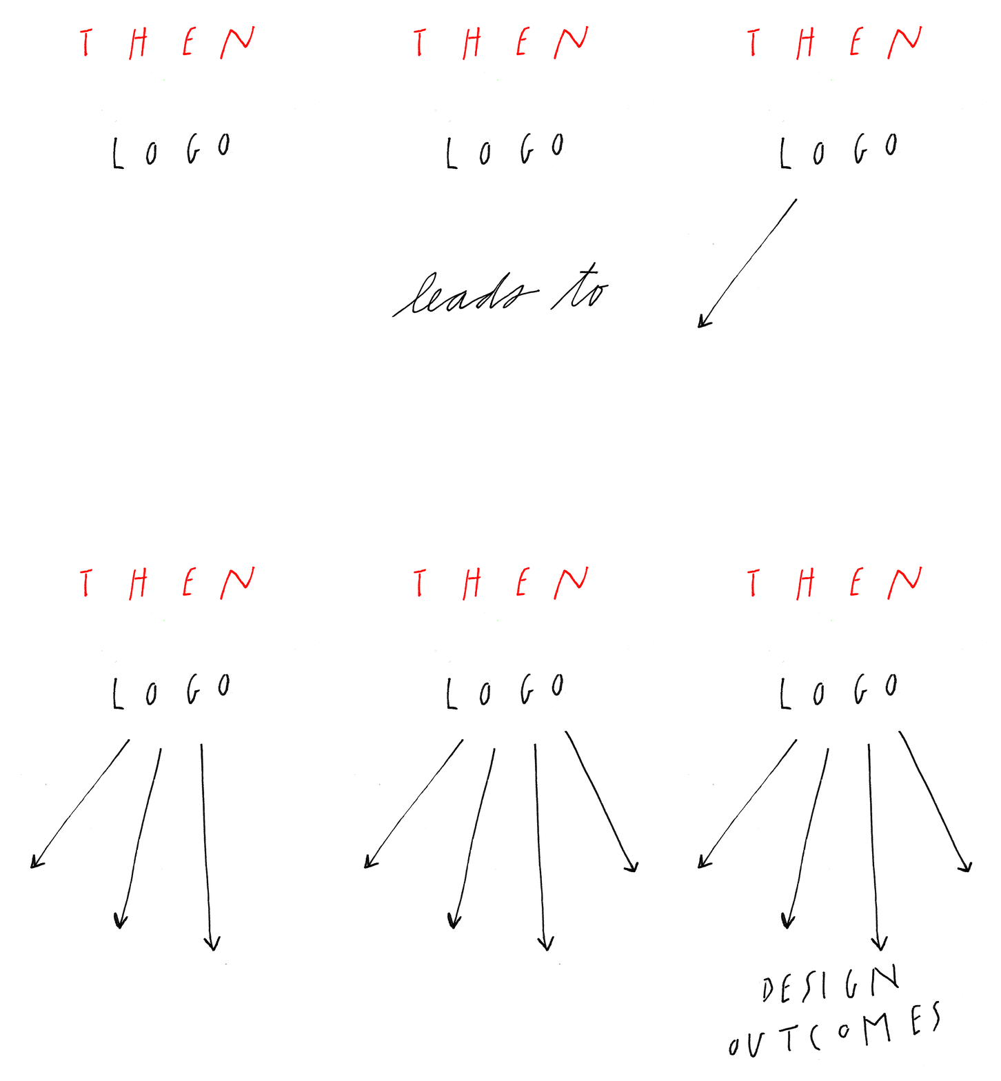
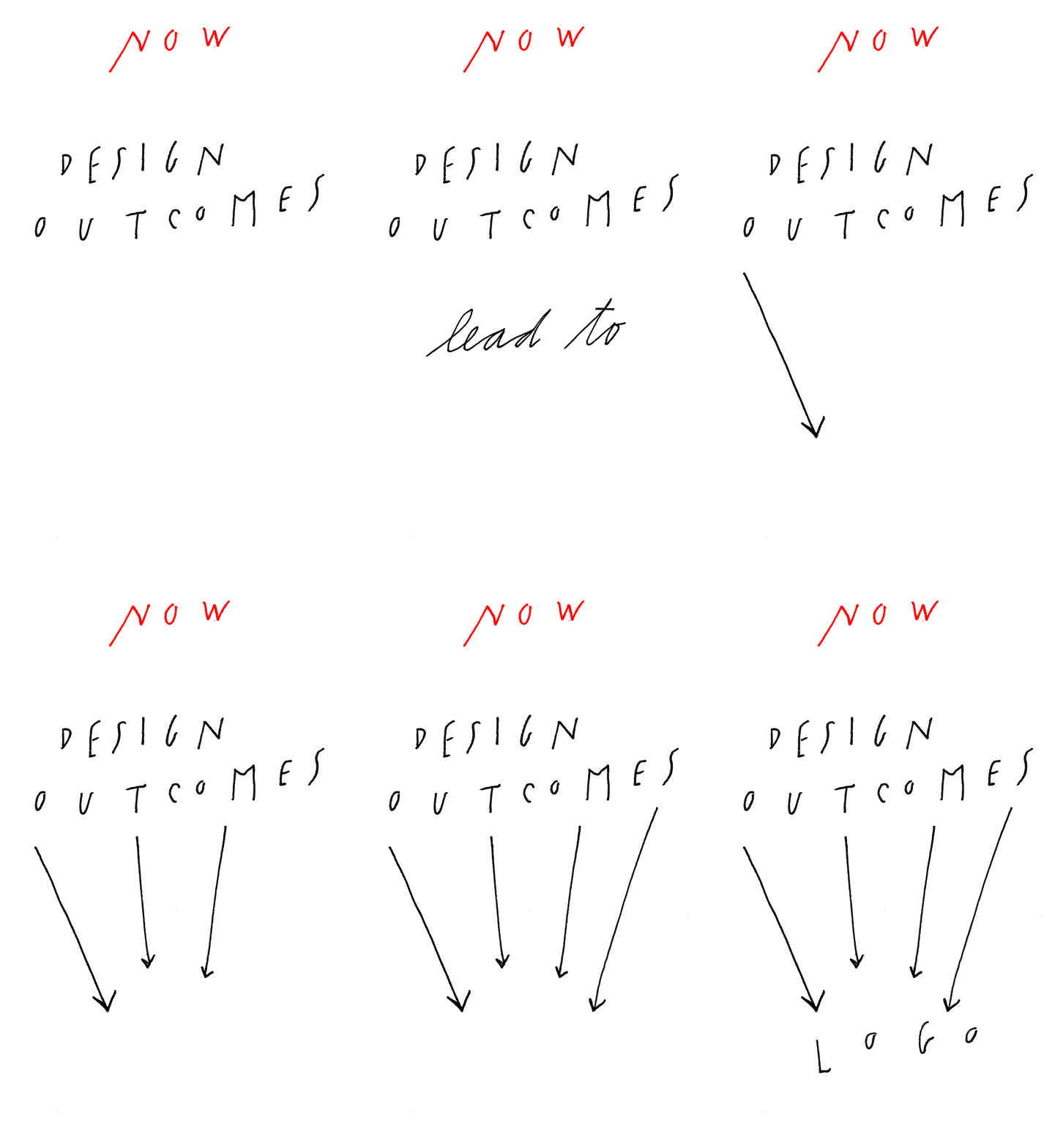
It’s hard to predict. This notion of the digital space. It’s already very different than 4 years ago. We were thinking more in a traditional way. We were thinking in our world, and then there was also a website to be done. Now we are already thinking to put the digital part much more in the forefront. That’s already very different. So in 10 years time, I don’t know if we will still be talking about print. It raises a lot of questions, like the idea of a logo — something like the mark. On a website, it’s not so important. Traditionally, it is still very important. So the question is when you would experience and see the mark? When would you have a physical interaction with this thing that you made. That is changing. The notion of the hierarchy of the mark and everything is below. Now, it is the other way around. We have the pyramid where the bottom is on top, the digital space. The mark is at bottom and is some sort of output.

