for / with / in
for / with / in
Evan Brooks, Lukas WinklerPrins, Philippe Cao, Catherine Schmidt, Christina Rees, Christina Webb, Kelly Walters, Michael McDermott, Ojus Doshi, Daniel Giuditta, John Caserta
This project was produced during “HTML Output,” a spring 2014 course at The Rhode Island School of Design. The website was designed and coded collaboratively by the eleven-person group using text editors, GitHub and Jekyll. The book layout engine, Bindery.js, was created by Evan Brooks with help from Lukas WinklerPrins. The project was edited by the instructor, John Caserta.
All interviews were performed between February and May 2014. We would like to thank the many practitioners who agreed to be interviewed for the project. Interviews were edited for readability and length, but mostly appear as raw transcripts. Work remains the copyright of the author. Cover pattern is by John Caserta.
The sans-serif font, Messenger Text, was designed and generously provided by Anther Kiley and Colin Frazer of The Service Bureau.
The serif font, Benton Modern, was designed by Tobias Frere-Jones and served with a donated license from WebType.
This copy rendered and output from
on
Conversations, graphic form and code that explore design for, with, and in the web browser
Contents
Conversations
Output
Code
Introduction
The graphical browser turned 20 years old last year. NCSA Mosaic supported 256 colors images in gif format using the newly minted img tag. Designed as a project to structure and share academic content, The World Wide Web quickly evolved into a distribution hub for designs intended for the printed page. Static designs and image assets were downsampled and placed online as additional output.
The web browser of this decade has reversed this workflow — the web now pulls larger audiences and elicits greater design attention. As a rendering engine, the browser itself can display live type and shapes with output almost indistinguishable from print-based tools. APIs
The recent advances in the web browser are so robust, that it has become my go-to tool in developing almost any project. Working within an IDE
And as it turns out, this pleasure and discovery translates to more everyday design problems: flyers, posters, and books. Creating designs through the manipulation of text and numbers provides real-time feedback in the browser — leading to many unexpected visual and programmatic outcomes found in this book.
— John Caserta
Peter Bil'ak talks with Catherine Schmidt
Peter Bil'ak works in the field of editorial, graphic, and type design, teaches at the Royal Academy of Arts in The Hague. Started Typotheque in 1999, Dot Dot Dot in 2000, Indian Type Foundry in 2009, and Works That Work magazine in 2012.
A big thing about HTML & CSS is limiting factors. The web is a platform designed by engineers at its core. It’s made great strides in the past couple years, but there’s still a lot it can’t do.
If you’re talking about typography in the browser, it’s important to realize that it’s really early days.
Oh yeah.
We’ve had print around for a few centuries. If you look at the typography on the web, you can sense that it didn’t go through the same developement and refinement. It’s better than it’s ever been. The progress is dramatic.
I spent a lot of time dealing with web fonts some years ago, in 2009, when we were deciding how web fonts should work for our type foundry. At that point I was comparing the current state of newspaper typography on the browser to the print edition.
Oh jeez.
It became clear that it’s exactly like 100 years ago in print. You can compare the newspapers from 100 years ago, say from 1909. All the newspapers in Europe would be using one type face at the same point size at the same column size, and if you made a clipping from a newspaper you would not be able to recognize what is what. So the tone and the journalistic point of view could be different, but from a graphic point of view they were identical. And if you looked at newspapers on the web they were doing the same thing. If in 2009 you looked at New York Times, The Guardian, Fox News, and an italian paper, they would all be using Georgia and Verdana at the same point size, using blue for the links, same placement of logos, same placement of the banners. Again they would not be identifyable at a typography level. While in print they’ve really made a lot of effort to define what the identity is, on the web there is no such identity, in fact it’s very generic. There’s been tremendous progress in the past five years in bridging the print and the web. But there’s still a long way to go. Just realize that it’s the early days.
Do you try to figure out that relationship between print and web with Works That Work? Is that something that you think about?
Well, of course.
I would hope so!
We try to simulate a bit of the experience. It’s even more complicated. Unlike the newspapers, we have a print edition, we have a browser online edition, and then we have all the ebook formats. If you look at colors, everything’s changing, if you look at proportion everything’s changing, there’s nothing shared. The only thing that remains constant is in fact typeface. That’s why we made the typeface for it, so there’s a bit of a connection. It’s the thread between the different editions, because otherwise there would be nothing, you wouldn’t be able to recognize it. But at the same time, each of the mediums comes with different limitations and different connventions, so each of them will behave differently. So print you use the conventions available for print, and for the browser you use different conventions. It’s not using the same layout. It’s the same font but we do something else — in print we are quite minimalistic about what weights, what sizes we use the type. On the web we don’t do that because we need to emphasize hierarchy differently, so we take slightly different decisions — same with the ebooks. But it’s important to recognize the different decisions the medium is giving you, and figure out how to make it work at low- and high-resolution devices.
Would you consider the web a low-resolution device?
It is, obviously it is — and it will be for a while. It’s changing, and it’s closer to what print can do, which means it will get simpler for people like us working with type design and making type for low- and high-resolution. Right now, yes, some typefaces, like Verdana, are made for low resolution and at high resolution they don’t feel like they’re at the right destination. I think that the need for making separate low and high resolution typefaces will dissapear hopefully, one day — not quite today.
Is there anything that you have thought about specifically when it comes to making type for the web instead of type for print?
Well, yes. You know what does not work on the web. If you take classical typefaces like Garamond and Bodoni and scale them down to 9 points, they will not survive this destination, because they contain some details for which you need that resolution to show — the contrast will be too high, and they become too fragile, which does not work. So if you invert it, you see that these are some of the things that do not work, so what is the opposite: make it a bit more robust, make it possibly wider, increasing the x-height. So you need to make some adjustments in order to make it work. And again this means that by including these changes, you’re making compromises, because the typefaces may not look as elegant in high-resolution, like in print, which is the highest resolution. Because suddenly they may look too clunky. You’re making it really fit a grid of pixels. So yeah, there are these basic things you need to do. And we also now know that type for the web needs to be larger as well. You just can’t use the same point size for print and the web. There are differences and you need to respect that to make things the most readible.
Does the web open up open up any possibilities for you and your practice?
Of course, and not just for me, but the web opens tremendous possibilities. It’s an exciting time because up until now, almost all typefaces were made for print. And it’s only in the last decade that we’ve started making typefaces for the screen, because we read a lot more on the screen. Matthew Carter was one of the first to pioneer type for the screen. And now people, like anyone, like you, can make the same thing. Like to rethink, if the screen is the native medium, what am I going to do about it, how am I going to use it. And it’s not about just removing the details, but more thinking about the nature of the screen. The nature of the screen is that it can refresh itself. It can include elements of time, color, it can include animation, it can be responsive, it can adapt to the reader’s position, it can do all these extra things that static media cannot. The experiments with using webcams and determining how far the reader is and depending on this the type can scale. Depending on the density of the screen and on the position of the screen, and the resolution of the screen, you get different results. So there are plenty of possibilities. And again, the fact that we forget about the element of time as well. You can do something which is using time. You could almost do animations with something that refreshes itself and updates and you don’t need to keep moving your head maybe, but something else could move to aid your reading. There’s lots of exploring to get the most out of the medium. And again in print, we have a few centuries of development, right, so we know what is optimal, we have experience. For the web we don’t know what it is, so there’s room for research.
You’ve written this really nice piece defining typography that I really like, and you’ve been exploring that through your own choreographic endeavors. Is there any relationship between a potential for responsiveness and a changing definition of typography, or a different definition of typography? Does it impact that definiton at all?
Well there’s a general problem with definitions. They’re always behind. They’re never up to date. Definitons are the secondary ones. There’s always need to update definitions as soon as more language is made. It’s a self-observating mechanism. But, if there’s one useful thing that a definition makes, it makes it clear at least for myself by writing it how things work. So, especially when I do a bit of teaching. It’s a reflection on what we’re doing, how we should be doing it, what is possibly the next thing in doing it. And even though we know that all the classifications and defintions are bound to be limiting because they’re observing what’s happening, and they try to react to it. As soon as there’s new developement, I think you have to redefine everything.
No constants?
The changes are the constants.
Do you teach type differently when it comes to the screen, or just because of the screen?
No. In the school where I teach in the Hague we try to be very technology-agnostic because it’s likely that the technology will change faster than the designer. So we try to push design in a way that you may have to adopt technology through it rather than the design follows the technology. And again we have experience with this because when you start solving with design the flaws of technology, the technology changes. You step behind. So, if someone says screen really is important — reading, in general, does not change. The human eye will not change. So we base it on this rather than the pixel density or hinting, something that will likely change, might be the first thing to change. Although we do try to understand the tools and environments that we work for, the design should be the leading things, not the following.
With you on that.
Andrew LeClair talks with Christina Rees
Andrew LeClair is a New York-based designer interested in archiving and digital publishing. Projects include Ether Press, Otlet’s Shelf and Flatfile
How do you interact with the browser when creating your work?
What I like about the browser is that it’s fluid and so designing with it is fluid. When you design in InDesign, you place each element in a particular place, and that’s static. It’s fun when you start to set up rules that determine how things should flow in a browser, and you start to see how those rules can produce more interesting layouts. It’s more like a building a system instead of just building a single composition.
How does your process/approach change when working with different mediums?
I don’t think it changes that much actually. A lot of the same issues apply. What’s different is that when you are designing in print you’re thinking of only one set of relationships. You’re thinking of the relationship of a headline to an image to a deck to a piece of body text. When you design in the browser it becomes more complicated, because now you’re thinking about that arrangement and many other possible arrangements that emerge from the system that you’ve set up. If someone resizes their browser down, at a certain point the proportion of the headline becomes too large relative to the frame (the viewport that they’re looking at your design in). It becomes more three-dimensional. You can think of the x and y dimensions of your design and its proportions and then the third dimension as the variability of the sides of the viewport. It’s more of a continuum of different possibilities.
There’s this idea of chaotic systems that shift between different states. A simple example is a double pendulum that generates very complex behavior, and you can’t tell from any state of the pendulum what it’s going to do next. If you look at one of those systems, there tends to be certain areas it will gravitate towards. These are the stable resting positions of the system that it can shift between. There’s often an unstable boundary at which you can push the system and it will move into that unstable boundary and then either revert back to the state it was in or move to a new state. When you’re designing in a browser, you’re thinking about all the different viewport sizes. You’re thinking: at what point does the system of relationships that you’ve set up get destabilized and have to shift to a new arrangement that makes sense? What are those different stable arrangements and how do you have the design seamlessly transition?
The content in a website is always changing so you have to leave some of the subjective decisions about layout and sequencing up to the browser or the user. At Project Projects, I worked with Adam Michaels and Rob Giampietro on a site for the philosopher/theorist Susan Buck-Morss that archives collections — or constellations — of images around different areas of her research. The images are arranged in loose grid visual clusters according to a few simple rules that determine which images should be large, which should be small, and how the images should be arranged together. When I was working on this system, it was an interesting feedback process of tuning different variables until the output felt right, while at the same time still producing surprising results.
How can design tools (like InDesign or HTML) affect the final form of a project?
It affects it a lot. There are certain things that a tool will let you do very easily, and then other things that are harder to do. You can think of the tool or the medium as having a grain, and you can either go with the grain or go against the grain. At a talk that I saw at the Cooper Union, Petr van Blokland talked about the difference between the ideaspace and the toolspace. The toolspace is all the things you can do with a tool, and the ideaspace is all the possibilities that you can imagine. Those two things may partially intersect or one might be contained within the other. You might have more ideas than what you can do with the tool or you might still be learning how to use the tool which means you have a smaller ideaspace than the toolspace.
To be more specific, in a website it’s easy to center things horizontally, and in InDesign it’s easy to place things in asymmetrical positions. If you look at a lot of web design, it’s centered because that’s what is easy to do, and when the browser width changes it makes sense to have something that’s centered. If you look at design that looks the most web-like, it’s a centered single column of text, and if you look at design that looks the most book-like, it’s a text block that’s asymmetrically placed.
About the Ether Press project: why did you choose Twitter as a source of content to translate into print?
I like Twitter because it’s ephemeral. One of the ideas that motivated Ether Press was the idea that a book (like a website actually) no longer had to be a fixed thing but could be something that is published only on demand when it’s needed. It made sense to use a source of material that was changing often. If I continue to develop the project I would make different books to be published under the Ether Press imprint. Ellen Lupton has said that a lot of self-publishing is “publishing the self” and so I think it’s nice to connect Ether Press as a publishing platform with an online platform that has such a low barrier to entry.
What thought processes led to the formatting decisions in the book?
The book has an index that it generates with the words you use across all of your tweets, and it also has a section where all the tweets are run together in a single textblock divided by month. I included an index because I wanted it to have all the parts of a book, and it also seemed like part of one’s motivation for creating an archive of your tweets was self-reflection, so being able to see data in a different way seemed interesting. You can see what words you use a lot and what things keep popping up. You can see all the people that you had @mentioned — those would be listed at the beginning of the index — so the index also revealed your social network on Twitter.
The formal quality of the book came a lot from TeX, which was the typesetting system that Donald Knuth created. You plug in content that has markup very similar to HTML and CSS and it creates the PDF pages by running the text across multiple pages. This project actually uses ConTeXt, which is a variant of TeX that provides more control over typographic detail. The typeface is called Computer Modern and it’s one of the typefaces generated by Knuth’s METAFONT program which he built to generate typefaces for use in TeX.
The interesting thing about Ether Press was not the actual making of the book, but how people used the book. My favorite part of the project was that people could set their own title, and that was interesting because you could see how they were actually thinking about the object. Some people would think of it as more of an archive and other people thought of it as humorous to be printing out all of their ephemeral tweets. A lot of people gave them as gifts to other people which was interesting, kind of like saying, “I’m listening to you," or “What you say is important to me”. Some were really thin because the person didn’t say very much, so the book was more like a poetry chapbook. Others were really fat, so the book was just this brick of chatter. One person asked us to typeset a book with just the question “Will you marry me?” repeated. They were going to give it to someone to propose.
What is your opinion on the temporarily of web content?
The web is ever-changing. You can’t count on a particular site that you used to go to still being there or being the same. We’ve experienced website redesigns enough times that we understand that the web is not a place that always provides a sense of familiarity. Now that the web has become a place where we can do a lot of reading and finding things, print will become a place where you can have something that you can own. You can have a book in your space, and you can know that when you open it, it’s going to have the exact same thing that it had in it last time.
The two mediums push each other further apart so that they can do more of the types of things that they’re good at. In general, print might have been used for sharing ephemeral information (like newspapers), but because you have to get it [a newspaper] delivered to your house physically every day, and then because you throw it out, print is not necessarily the perfect medium. From the time that people had newspapers, they were thinking, “what if there was a magic newspaper where the pages could change?”. Now we have that, and it makes more sense in that medium.
There’s a great quote from Irma Boom. She said whenever she goes to a book store she’s depressed by all the books that could have been PDFs. If you actually think about what she’s saying, it makes you question what about a book couldn’t be replicated in a PDF. There are a lot of advantages to a PDF. You can search, you can carry it with you and it doesn’t weigh anything, and it doesn’t take up any space in your apartment. [Irma Boom’s quote] forces you to think about what makes a book better as a book. What types of books are better as books and what types of books are better as PDFs?
Do you have anything else to add?
We’re in a transitional period right now where people are particularly interested in the relationship between web and print because we’re experiencing the shift between them. If you think about it, no one’s talking about SoundCloud and vinyl. It’s a temporary phenomenon that’s happening because we’re experiencing a lot of print artifacts that we’re used to becoming superseded by digital artifacts, and that is making everybody think a lot about the value of the different mediums. When you think about them in relation it makes you think about how to translate things from one to the other and that’s a good way of figuring out what each thing is good at.
Kevin Kelly — who I don’t agree with on everything — said one thing on technology I thought was interesting: if you look at the old Sears and Roebuck catalogs, and you look at all the things that were available for sale then, most of those things — farm implements and random pieces of technology — still exist and are used today somewhere in the world. So there’s a certain sense in which [older] technology has never completely been superseded. It still has a value but for fewer people or in specific places. We have industrial farming implements but in many parts of the world we still use a basic plow drawn by a horse. It’s not like new technology wipes out the previous technology. We just think it does because we’re looking at it from our elite circle. It’s more that another technology gets added to our inventory, and our total range of possibilities gets expanded. Now you can type on your typewriter, check Twitter on your iPhone, get your New York Times Sunday paper and check it on your iPad. They can all coexist. That’s a good thing to remember. It’s ultimately not that print is dead or the web is dead. Those questions will never get resolved.
Jason Pamental talks with Ojus Doshi
Jason Pamental has worked on the web since 1994. With a background in design and an intimate understanding of technology and its application on the web, he has led creative and technical teams for NFL and America’s Cup teams, Fortune 25 and technology corporations and many other clients, serving in both creative and technical roles. A passionate advocate of web standards and accessibility, Jason embraces new developments in web typography and responsive design as the next logical evolution in usability, search and maintenance of complex web systems. In addition to running H+W Design Company’s, Jason speaks about Responsive Design, Web Typography and Web Strategy at conferences and pretty much anywhere people will listen.
Last week, you went to London for the Future of Web Design conference. Can you talk about that? Why is this conference significant? You’ve been going for a few years and so maybe talk about your experience there.
Yeah I’d love to because it gets at the heart of one of the questions you sent to me, which was how I came to be so interested in the speaking and sharing and teaching aspect of this. While I was working at an old agency, one of the highlights that came out of working there was getting them to pay for my first trip to go to a Future of Web Design in New York in 2008. The way they run their conferences, at the time, was one track and it was just a big room. It was actually in the Roseland Ballroom, a pretty famous club in New York City in the Times Square area, and so it’s just a big room with a bunch of chairs set up. You really had no idea who might be sitting around you. Most of the speakers were sitting in the audience and watching the other speakers, and I remember getting into a conversation with Dan Mall, who is a tremendously well-known designer. At the time he was working at Happy Cog, which was Jeffrey Zeldman’s...
In Philadelphia?
Yeah. I think he was working for Happy Cog, which was Jeffrey Zeldman’s agency, so it is really connected with some of the biggest names in our industry. We just spent 15 minutes talking about subway maps. He was just the nicest possible guy, and all the other speakers were just as generous with their time — inviting attendees to go to the pub with them after the conference before we went off to that evening’s party. And that accessibility to the absolute biggest names in our industry was really remarkable to me. I think it was the next year or the year after, I had already paid my own money to go to the conference because I knew the agency wasn’t going to pay for it. And then, in between paying that money, two things happened. One, I quit, and decided to go work on my own. And the second thing was that I found out my friend Jesse Friedman, who works here in Providence and is a really talented WordPress developer, had been accepted to give a talk at Future of Web Design in New York at what they call their “Brand New Rising Star Track”. And that Rising Star Track is something they still do to this day to give speaking opportunities to people that have never spoken at a conference before but have an intriguing idea.
Hmm.
And I’m sure we’ll come back to this, but my background as both a designer, which is what I studied at school, but also as somebody that really built a lot of things — designing databases, doing .net coding, building complex content management systems from scratch — that gave me what I felt was a fairly unique perspective, and it’s still a fairly unique perspective in the industry. I thought I had something to share about that. When I heard that Jesse was doing this, I looked back at my blog, and I found something that I thought summed up what I really wanted to talk about pretty well. So I sent an email to Ryan Carson, who was the head of Carsonified (that was still the company at the time that owned Future of Web Design and put on the events) and to the other person who was in charge, her name’s Cat Clark (she’s since gone to Smashing Magazine) and I said, “I think this would be a great addition to your conference. I’d really love to come speak.” Within a day or two, they wrote back and said “Could you record a short video of yourself?”, which I did, and they accepted it right away.
What they do with the Rising Star Track is that you don’t get paid to speak, but you don’t have to pay to attend anything. You can go to a conference, you can go to a workshop, which, in itself, is hundreds of dollars. I figured since I had already paid, this is just a bonus, getting the money back and just using that to pay for my hotel. And so that chance to go back and do what somebody else had done for me and try to inspire someone else to share an idea and take what they’ve learned and go back and do something interesting with it, was really compelling. I have a history of teaching in the family — my dad was a college professor, my brother is a professor, other teachers and various relatives — and I don’t really feel that I can take the time to teach a semester-long course, or at least not very often. But I’ve enjoyed it when I’ve done it, but this is a way to take that teaching opportunity and cram it into a day. Or an hour, and share something. But at the same time, be really present at that conference. And then be that person that Dan Mall was to me. Or Liz Danzico or Paul Boag or Jeffrey Zeldman. And that was fantastic.
And so they invited me back the next year, because I was amazingly fortunate — it was the right title, the right topic, I don’t know what the combination was — but the room was packed and it was really well received, so that was pretty awesome. They invited me back the next year and then a couple years later, they asked me to come back to speak and do a full day workshop in New York, and that turned into London and Las Vegas coming up in June. They were my start, and since then, I’ve gone on to speak at a number of conferences all over the world. And I will always have a fondness for the way they handled that, and they still do. And I’ve been able to recommend people and give references and see them go on to give talks and get asked back again, and that’s really gratifying.
Awesome. I guess this time around, what would be one thing that you learned, or maybe one or two people, either Rising Stars, who are people that are focusing on the next part of what the Future of the Web is?
I’ve done a number of one-day workshops on Responsive Design and teaching the nuts and bolts of it. I also do a lot of speaking about the design approaches behind responsive design and how to think a little bit differently as a designer. Looking at it from both perspectives, what was really pleasantly surprising is that the group of attendees that I had for my workshop last week were incredibly sharp and had a lot more people coming to this with prior experience in responsive design. So we covered more material in that day and I had to make up material, so by the end of the day I was actually adding lessons that I wasn’t really intending to cover. Which was maybe a little bit trying, but that’s ok. A RISD grad, Mitch Goldstein, who is now teaching in Rochester, I think...
Yeah, RIT.
And he’s a good friend of mine and we started a company together before he went to RISD. I don’t know if this originated with him but he gave me the best quote that I have ever heard about being a teacher which is “to teach not to the slowest student in the class, but to teach just past the brightest one”, and I’m paraphrasing poorly but the idea of making sure that everyone is striving and everyone is helping each other to get to that goal means that no one’s bored but no one’s left unsupported. I thought that was a really great way to look at it. So I try to teach my workshops that way, I try and do my talks that way, because I think that this is our university. It’s really difficult to get a really good education about designing for the web.
There are lots of great places to get an education about design but to understand the connections between how design is typically been taught and how we need to practice design today, I think that connection is not well made in many programs. And I’d like to see that change, but I think that there are some conceptual leaps that schools miss in how we’ve been thinking and teaching about design. As I will often say, any piece of design needs to do two things: It has to be something that can communicate an idea and it has to influence behavior. Any piece of design is a commercial endeavor, or it’s not a successful piece of design. And that’s been true to cave paintings telling people where to go find food, on through all kinds of things about maps that tell you where the monsters, to things today to get people to buy a particular brand of soap. But everything comes back to trying to convey that message and get people to act on it.
That’s an aspect of design that is no different on the web than it is on print, but it has to be brought about and realized in different ways. Especially on the web when that means any number of a thousand different screen sizes. How do you still convey the hierarchy and meaning of that message in a medium and canvas that’s so fluid, but also has shifting proportions, and still get people to act on it? It’s absolutely the principles of design that apply, but you need to be able to act on them with a very different set of guidelines. I think that’s the gap.
And I don’t think you can say that you can teach design and not address that head on, and include designing for the web and for multiple screen sizes explicitly. Anymore than we can say, “this project has to be printed out and put up on the wall so we can critique it”, so there’s an inherent bias there towards print. Like it or not, that’s what all the faculty knew, that’s what they grew up with, that’s built-in. It may not be explicit and they may try to do their best not to be overt about it, but ultimately it’s things being put up on the wall and critiqued. So that’s done on a CMYK printer, and you can’t avoid it. And you have an x-acto knife because you cut things out and mock them up, simulating die-cuts. So we do all of these things, I’ve done it, too, and I still have some of them on my bookshelf because I love to see the things that I made. But that has to change for us to think about how design is applied and how we can successfully communicate our client’s message across every device and medium and platform — billboards to business cards to websites.
What is that mental shift that we need to have starting from the first time you learn about graphic design or learn about typography? I’ve worked at a startup in San Francisco, and the challenge for me was to start to think in a smaller screen size and not being able to do the same things technically with print that you’re used to…
Right, it comes back to block diagrams. On that small screen, you can have fewer elements, so the scale changes that you need to present there in order to preserve meaning can be much more subtle. That’s the biggest area of research and writing for me lately is looking at typography and responsive design and how the meaning of this level heading versus this level heading versus this body copy versus this callout. [And looking at] how exaggerated these things need to be on the large screen, because you have so many other distractions. In order to have the right volume for any given element to say it is more important, that scale has to be more exaggerated. Versus on that small screen, you don’t see the extra navigation, you’re probably not seeing the ad, you’re really looking at headline and copy, or maybe it’s a series of headline and copy. You can be much less heavy handed.

So it’s actually a scale change. In print design or designing for the desktop, you can go by [Robert] Bringhurst’s Elements of Typographic Style almost explicitly, and things will work really well. It looks really exaggerated on a small screen, so just bring the scale down.
Body copy, I think should stay the same. I’m a big advocate of that, and I know a lot of people have talked about different ways about how to handle that dynamically, but I don’t agree with it because I think the device makers have done a really good job of addressing that. So I leave that alone.
I noticed that actually. It was on the exercise website you put together, and I shrunk the screen and I was like, oh ok, the body copy is not changing.
So physically, it is different from one device to the next, but the device manufacturers have come up with their own decisions about what one unit, base unadulterated unit of type should be. And on desktop browsers, the equivalent of that is 16 pixels and that is a relative, it’s a fixed unit of measure that renders differently on every single device because what 16 pixels is changes, but oddly enough, when you set the font-size to 100% on the base HTML tag, that will render text at the equivalent of 16 pixels on every device, so that’s kind of the leveler. What that renders at on a phone tends to yield a fairly nice readable size of text. And it will get you a line-length, if you’re using most of the width of the screen, that is very close to the low end of [Robert] Bringhurst recommends for newspaper columns. It’s pretty close. It’s like 35 to 40 characters, roughly, as opposed to the 40 to 50 he would recommend.
But by making the text any smaller than that, it can very often start to collapse and get very muddy. So I tend to leave that alone because I think it’s close enough.
With regard to making other changes, I’ve gotten into some discussions with some people that have advocated this, and I just have to say I disagree with them, because anything that we’re doing to dynamically change the size of the body copy based on reading distance is going to draw a significant amount of resources form the device, so you’re compromising the longevity of the use of the device in something that most people would simply adjust their arm. And we can’t accommodate for their eyesight either, so if I’m wearing my contacts I have to hold it further away, if I’m wearing my glasses I can keep it a little more closer, more comfortably, and that’s fine. And I don’t care, but I do that automatically and so does everyone else. So the pad, the tablet, the desktop, that’s a physical device that you can pull closer or push further away so it fits your comfort, but that’s not something that you could know as a designer about me. I don’t need you to waste time on that, I want you to focus on other issues.
So I think we have to draw lines some places, and say that the device manufacturing is better here. But I can take that as a given and adjust my scale for other elements on that to be more subtle, so that you can see, as that proportion changes, you still know that this is an H1 heading, you still know that this is the most important thing on the page, you still see that callout as something different from the rest of the page. But it doesn’t have to fill the entire screen. Because things are going to wrap, and line-height is pretty important, so as things wrap you have two line headings it still makes sense, but it will wrap better if it’s not quite so big with one word per line.
That was something that was an article I was working on with an editor from Typecast for about a year. And we would get busy and kind of go away from it and then come back. I kept putting it up on the screen at Artifact conference, first in Austin in May and then in Providence last fall, and you know the article is going to be up there some time but here’s the preview of something I’m working on. That article went up and the response to that article was better than anything I’ve ever written, anything I’ve ever put out there, and I’ve been told that it’s by a factor of 2, the most popular post they’ve ever put out. And they’re awesome, so they invited me back to do a webinar and they’ve just been really great to work with and it just struck a chord. And that’s how I’ve been framing a lot of things I’ve been writing and speaking about, because it’s clear that people are really looking for better guidance about how to deal with type when that is such a big factor with how we communicate design and ideas across all these screens.
My next question is around experimentation for this stuff. At some point you have to try it out, but I’m not going to have the google glass or big tv to test with all the time. Is it just agreeing on certain things you’re going to tackle and leaving the other things, like the body copy, to the device?
There are a few ways to tackle it and this is a problem that’s common for everybody that’s doing responsive design. Simulators can help, so I have an Android simulator and iOS simulator. And that allows me to see what things would look like on various sized iOS devices as well as different Android devices and different versions of Android OS. I try and make sure that we hang on to older devices, instead of getting rid of them all the time. So we’ve got a small pile of old cell phones, or things that I’ve picked up from friends or eBay, couple different sized iPads, an old Kindle Fire, an old Android phone. So I’ve got a variety of things that I can turn on and see how they look. On the larger screen stuff, a lot of times that’s easier to deal with than a lot of people think because a lot of us have access to a 27-inch monitor that’s pretty high resolution. So open it all the way up and see what you can do.
And that was actually Jesse Friedman’s talk the second time we went to Future of Web Design. He brought up the idea of what to do with larger and desktop size screens. The example that he gave was a blog — why not bring the comments up next to the blog post instead of underneath? And I really thought that was fascinating because it changes the context in which you read the blog by being able to see the comments at the same time. It impacts the way you understand the content and take it in just by positioning things differently.
Nick Sherman (a type designer for Font Bureau) has talked a lot, recently, about typography in responsive design on large screens by being not afraid of making the type bigger. So if it’s a really big screen, chances are that people are further away. Actually, that’s an example where it may make a lot of sense to make the body copy, bump it up, you know 25 percent or 50 percent if it’s on that big a screen. And also to look at display faces instead of just making body copy larger.
So you can do some really interesting things with that that I’ve really only begun to experiment with. What a lot of us forget is that a lot of the large screen, flatscreen televisions that we might have in our living room have an HDMI input that we could plug our computers into, so actually, it’s not so hard. If you have an Apple TV, you don’t need to plug anything in, you can just flip your screen over and start displaying that way.
So there are ways that are relatively cheap and easy. Simulators are mostly free, so you can test a lot of things that way. Old phones you can usually get your friends to give you if they’re getting a new one rather than getting $10 bucks back from Gazelle or whatever. You can accumulate your own little lab, and then you can also talk to other friends and designers in the area and see what they have. Some places have formalized it into a device lab. I don’t think anybody around here has actually done that, but my friend Steve Croft and I have a pretty good device collection that we bring to the workshops that we do, so we usually have a dozen different things that people can play with. So it’s getting a little creative with it.
At the heart of responsive web design, as far as I understand, is essentially media queries in CSS, would you agree with that? There is the relative sizing aspect and then the ability to have these break points when the browser tells you what device you’re on. When was that introduced?
I think Ethan Marcotte first wrote about it in 2009. Then his book came out in 2011. And it came out, I remember getting a copy of the book somewhere around May, and I was working with a startup here in Providence building websites for independent schools — that’s actually where my wife and I first worked together, we’ve been married nine years this summer, but this was the first time we’d actually work together — and I remember getting that book. We had a huge number of sites that we needed to start the actual HTML and CSS portion of, we had been working on IA [information architecture] and building up the content structure and everything. We had seven sites that we had to do the theming on starting in August, and they all needed to launch by the end of the September, or something crazy like that. Naturally that seemed like the best time to try something completely new [laughter], so I took the base theme that we were using and I rewrote it the first weekend in August as a responsive theme and we did every single one of those sites and every one since as a responsive site. And that actually made the process easier, I think, because I had so many upon which to test these things out and work out the ideas. That base theme ended up being the basis for about 35 more sites that were all built around the same code base. And it would evolve and get better, but there’s the baseline being responsive centers around using media queries to react to different device window sizes and making everything sort of flexible and fluid first.
You know, kind of the running joke is the first websites were responsive because there were no tables. But that’s actually not true. They were fluid. So you would open the window different widths and you would have different line-length of text, that’s only one piece of it. It needs to be fluid so that it can scale but then you need to do things at different sizes, because then your line length is going to get too long and the design is not really going to hold up, so you need to start to reflow things, And that’s where the media queries really start to come in. That’s Ethan Marcotte’s book, covering those three things. You’re going to make the grid scale, you’re going to make the media that you place in, either videos or images, scale along with it, and then with media queries you’re going to make layout decisions based on available screen real-estate, and that’s kind of the base line.
I think, as an industry, that’s kind of where we are now. We understand the basics of responsive design and far beyond just those three basic things, we’re doing some amazing stuff, but from a design perspective, we’re just getting familiar enough with responsive design to just get past a bunch of scaling boxes on the screen. Which I think is a fair criticism to level at a lot of sites, because there’s a huge amount of technical know-how that has to go along with the design thinking in order to make all of this work really well, and the tools are really only now just staring to become commonplace to help us tackle that.
Such as?
Such as visual tools that we can play with like Adobe’s Reflow or Macaw or Brackets, I mean there’s a bunch of different sketching and design tools that will help us prototype these ideas. Then there are these other things that help us code them more efficiently. So working with Bootstrap or Foundation, working with SASS instead of writing your CSS all on your own. Sass or LESSare preprocessing languages that let you use variables and math and all kinds of other things. So you don’t need a calculator to make a responsive site, you can use a formula. And those things help us as designers because there are shorthand, so we don’t have to write everything fully from scratch.
But I think what I should back up and say, because I am being very conscious in saying designers are doing this, because I think designers have to do this. And I re-quote Jeffrey Zeldman every chance I get: “Real designers code.” They have to. And I think that again comes back to the issue that I have with the way design is taught. There’s this resistance to that being a skill-set that designers need to have. And I think that as much as we have to have an understanding die-cut and vellum and overprinting and metallic inks and all those things in order to do really great print work, you really need to understand HTML and CSS in order to think through design challenges in the native medium.
I don’t often design in the browser, even though I’ve been doing this for 20 years. I wrote my first HTML 20 years ago this year, and I still oftentimes don’t feel that I’m good enough, I still sketch faster, because I’ve been using Illustrator almost that long, I still work in Illustrator faster. So many times, that’s how I work out my ideas.
But I know I don’t know what they’re really going to look like until I get it into a web browser. So it was actually just this week that has been the most successful experience of designing in the browser and it’s because it’s a very data heavy project. I had to nail those patterns of representing these search results, and so I wrote those first, and then started building them into a larger page to test out these language ideas to see if I could visually create units out of these small units and make the mass of them on the screen still read as chunks without starting to draw boxes around everything, because I think that just creates more noise. It’s one way we do things but it creates more visual tension between the objects than it does allowing them to focus on the objects themselves. So that’s probably the only time where I’ve been far more successful there than I ever could have been trying to design this whole layout in Illustrator and make it translate.
So that’s a nice way to talk about what this interview is for: our class HTML Output. Central to the class is the idea that the browser is going to be, or is, a tool that a designer can use, that we’re gaining a lot of capabilities that Illustrator and Photoshop have been traditionally used to do, so we can use the browser as our own experimental plaything, you know? You said you just sketch faster in Illustrator. Are other people comfortable with the browser as this thing they can just go into right way, or not? Or is it just a personal thing, have you broken that down a little bit as to why that is?
If you look at all the writing about web design and development over the last number of years, there are plenty of people that write about design in the browser. And one would hope that the people writing about it and saying it’s so great actually do it. So if you take that, then there are plenty of people that think that way. And I think that’s fair because there are lot of people around my age that maybe didn’t start in Illustrator as soon as I did, and they may still work better with markers, and they may be brilliant with doing design and blending colors and working very fluidly that way, and I’m not one of them. My sketches in my sketch book are usually really rough, but I always have them. I have them all the time. I have a stack of them going back to even while I was in school but I always have a little notebook with me [takes out sketchbook] that I can just jot down ideas in, and very often it’s actually the writing that’s more important than anything that I’m sketching in there, but I can go back and see the genesis of almost every project that starts on paper. And I think that people that started later, people that started 10 years ago and were working in HTML right away, may be thinking more fluidly there than I am. And with a lot of these tools, like SASS and Compass and mixtures that you can use that are jump starting getting elements on the screen or using a framework like Foundation or Bootstrap. It allows you to not think about how to put these elements on the screen, just worry about how you’re placing them and then styling them from there. And there are lots of hooks built into those frameworks in order to do that.
So I think that there will be more and more designers that have the tools to think more fluidly in the browser. And I think what that affords you, when it’s not an impediment to creative thinking, it can open your eyes to new opportunities. And I think that’s really the key, is however you can think and realize it the fastest is the right medium to work in.
But I’ve also now seen that that’s not always going to be the same answer, because the project may dictate that one approach is better than the other.
So we’ve talked about the @media queries, and in this whole responsive design framework we consider screen sizes, mobile, tablets, all the way up to huge tvs. Where does print come into this? Where do print style sheets come in and how are the technologies incorporating the fact that sometimes we may still need to print out articles or webpages or what have you?
There’s almost always a print style sheet that goes in there, and ironically enough, that was the first use of the media query, and that’s been around for years, but it’s essentially exactly the same idea. Instead of saying it’s for screen and minimum width do this, you’re saying it’s for print, so any time somebody that hits print, that’s the last style sheet loaded and so that kind of takes over. And what most people do with that is really just strip out a lot of color elements, strip out a lot of background elements, they might change type size and just simplify the layout for what’s being printed so that what’s being printed is really just content. And in many cases, that’s the ideal way to do it. The irony was that yesterday, I couldn’t easily make a print of this design to show the client. I had to show it to them on screen, because if I tried to print it, I’d lose all the stuff.
So it’s not without its challenges because it’s an imperfect solution to mix the measurements. It’s really hard to say and know concretely that I would like this to print 12 point, because that’s still the measurement system that matters in print. And I’d like to lay out the page in this manner with these margins because you don’t actually have that much control. Even for something as simple as the CSS command to create a page break is implemented differently in different browsers. So it’s a real pain.
For Bay View Academy here in Rhode Island, we built an online ticketing system for their auditorium. They sell the tickets to all their seats to their auditorium and they always need to print out the unsold ones to sell them at the door. So we built something with a print style sheet in order to print out so many tickets per page. This is a challenge I need to sort out in the next few days: they want to use perforated sheets, and they’re different dimensions. So I have to see if I can make this work to say that when we hit print from this page, strip out all these other elements, after so many records, insert this page break, I want everything to be this size, and to see if I can get that to print on some Avery perforated paper. Not sure how well it’s going to go [laughter]. But, I know that if I did it out of chrome and saved it as a pdf, I could reliably get three to a page with the page break where I want it every time, and then she would be able to take a stack and slice, slice, there’s her stack of tickets. This will take that a step further, but dealing with print is still a very real thing. That’s a system that’s been built in the last year and half, and that’s a major component of it. The people get an email that needs to print with formatted tickets, and people can also print out a chunk of tickets together and have that still look like something.
But do we have to consider it as automatically stripping out stuff? You can strip out and have content and still make it look beautiful in the way that you do the type —
Absolutely, and I didn’t mean to cut you off, but there are certain things that don’t print reliably. Oftentimes on the web, when we’re trying to build this design, a combination of images are placed in the foreground or textures in the foreground, as well as things applied in the background, and it’s the interaction between those things that give some of the most interesting designs. Background printing is a checkbox option in most browsers and they don’t all default on or off. So you don’t really know. That’s why the approach tends to be: use less ink, less toner, strip it back to the content that they need to see.
You print out this news article, and it still has a nicely typeset header and body copy and the inset photographs that are elements placed on the page will still print, and you can do some pretty interesting things there actually by swapping out resources for a higher res photograph so that it will print nicer. And you can also do things like if you have a graphic header, if you are using SVG graphics, those will print out as vector objects so they’ll be super sharp when you do that. So there are some things that you can do that will work better on higher resolution screens as well as for print output. But because there are so many things that are out of your control in how things are formatted, borderlines will sometimes print but some browsers will treat that as a background, so it’s difficult to know concretely how that printed solution will work out.
Ironically, that was the best use of Flash I was ever able to come up with was a print on demand system for North Sales. My friend Dan and I built that in 2001, and that was how they printed sales quotes predictably and really nicely out of any browser on any platform — by building it as a flash object and printing that. It was actually a data-driven, dynamic page that layered sale artwork and text and brought in customer information and pricing and all that, and you hit print out of that Flash object and it was 100% vector artwork that looked fantastic every time. And that served as their system for printing sales quotes in North America for over 10 years with very little touching from us after we left the company.
That’s really neat.
That was replaced by a system that I designed and built for them when I was still working for North Sales to do it as a PDF and that’s still in use now. So it took the same ideas and then now builds up a PDF dynamically, and can stack them together in multiple pages and give you print output in the same manner.
In class, we’ve experimented with responsive icons in class, we’ve seen that. But just in the last year, I’ve learned about Font Awesome or these other ways to take iconography or icon symbols, traditional vector based things, and build them into fonts. Have you worked with those before? When was your first time using those? And are there definite benefits or any pitfalls with using something like that?
I think there are some great benefits. I’ve been using them for two or three years now extensively, and there’s a major drawback, unfortunately. At its heart, it’s a font that is created out of monochromatic symbols, because currently there’s no widespread font technology that allows for a multi-colored glyph. So that’s one limiting factor. If you’re ok with that, then you can use a combination of that glyph or multiple glyphs, that’s something that some people do, and then CSS to do something in the background. It’s quite common to create a CSS circle around a letter, which is essentially what you’re doing with this font. You’re putting a letter that translates to a symbol that’s in that typeface, and then you can color it, you can shadow it, you can put a border on it, you can put a background behind it. You can create nice, scalable, sharp icons, buttons, whatever you want for all of your Facebook stuff but also for UI cues, like the magnifying glass or a list icon or sharing icons.
So there are lots of uses for them. It’s very much audience dependent as to whether or not it’s the right answer because it requires support for @font-face. And if you have a more international audience, you need to recognize that Opera Mini does not support @font-face whatsoever. That’s really not a big deal for all of your text because you’ve probably been smart enough to list a set of fonts, you have our webfonts listed first and then you have the so-called web-safe fonts listed after, like Helvetica, Arial, Times New Roman, Georgia. And so if the webfonts are not loaded, they get it in that fallback font, that’s fine.
There’s no fallback if your icon font goes away. And there are various ways that you can deal with it by substituting a word, but the integrity of your design, the intent of your design, is not going to survive. So a lot of people have started to recommend going a different route. The Filament Group in Boston created this tool that will let you take a folder full of SVG icons, upload it and they basically turn it into an SVG sprite, which is a large image that combines all of them. And it gives you the CSS to display the right one in the spot that you want it, but it also makes a PNG fallback. So you have something that works across all browsers that will look really sharp on all of the devices that can display the SVG graphic, which is all currently shipping browsers, including Opera Mini, and it doesn’t require @font-face at all. That’s perhaps a more universal solution.
I haven’t gone that route yet, I feel like I should, but I haven’t had a project whose audience is primarily going to be in Africa, Asia or India, which are the largest growth areas for Opera Mini. It’s an incredibly efficient browser combined with the server side technology that will highly compress the output so that on lower bandwidth and higher latency cell-systems in developing countries and rural areas, you can still get pretty decent service, and it also works on a much cheaper class of devices. In those areas where they have less infrastructure, where the handsets need to not be $100, they need to be $50, they need to be $30, maybe even less, you can still on most of the inexpensive handsets coming out of China or anywhere else, you can still run a pretty modern browser in a lot of ways and still get great connectivity. I’ve argued with them about this a lot and they’re not going to change their tune, and that’s fine. But that does mean that as designers, we need to make a consideration, if that is potentially our audience, that’s not the way we should go.
But the other advantage then, if we go SVG with our icons, we can add more than one color and if you’re really clever you can actually animate them. And SVG inside can also respond to media queries. I didn’t attend his talk, but I think his name is Joe [Harrison], has been doing a lot of work on responsive icons that are dramatically different at different sizes, so it’s not just scaling, it’s actually greater or lesser detail. And that could actually have the media queries built into it so that symbol will just behave differently based on the screen size of that device. Which I think is really fascinating. You can also build animation into that. So there’s a lot of interesting potential there that’s not specific to webfonts, it’s just a creative use of technologies that will get you more out of it then you could with any other combination.
At the Artifact Conference in Austin, you mentioned you were trying to figure out how type rendering was not working correctly, and someone came up to you and said you can use a CSS transform and rotate to “make the browser think a little bit”. I found this idea of making a browser think really compelling.
It’s compelling or unnerving, one or the other.
Yeah! [Laughter] Are there any other ways that this happens? I know this might have been a work around but…
It is, but it is an interesting one, because it’s exploiting the way the system reacts in order to produce better results. That trick came about in handling font rendering on older versions of IE, because on older versions of Windows, the font smoothing technology called ClearType was off by default. Unless a user knew some obscure control panel setting to go into, they were not going to get better font smoothing even though the technology was there. But, by rotating it literally 1/10000th of a percent, it takes it out of being standard text and turns it into an object that the graphics engine kicks in and says “Oh, I have to do something with this”.
The same thing holds true with an image. Those same older versions of IE were not so great at scaling an image. And that’s one of the things with responsive design is you’re always trying to have this image fill this space no matter what that space is. So technically it’s probably an image that’s a few pixels bigger than the width that you’re going to display and you’re always relying on the browser to smooth it, and all the other modern browsers are really good at it, including IE 9 and plus, but for IE 8 and below, it would often look really jagged or soft. Again, that rotation trick forces it to use the graphics processing to handle that and which often produces a much smoother result, the same thing is true of a typeface. The other thing that you can do is to apply a zero percent opacity shadow, that’s also a way to get Windows to try and add that effect, but since it’s not supposed to be visible, it ends up just generally smoothing the text rendering itself. That doesn’t work so well when it’s on a transparent background, but when it’s on solid ground it can be really effective.
So getting familiar with the things the browsers do and don’t do and what are the triggers that cause them to bring in a little extra fire power often can open up some interesting opportunities. And that’s still true now with handling font loading. This is an instance where I believe pretty firmly that the browser renderers are going in the wrong direction, in which they will hide the content from you until the webfont loads. It started out being called FOUT (the flash of unstyled text) because it would come up in the fallback font and then step into the webfont. But you get the content right away. Well then Webkit engineers decided they would rather not show you anything until the webfont loads because what would often happen is the text would reflow, because the fallback font wouldn’t have the same characteristics as the webfont, so it might be narrower or wider, might have a much taller x-height or a much lower one, you’re not really sure. If it’s a very stylized webfont then it’s going to be very difficult to have something that’s at all close. So your navigation might jump around and your widths are different so it might force things to reflow, the line breaks are going to be all different, and that’s kind of jarring. So Webkit’s decision was to not show it to you at all.
Well, there’s plenty of research that shows that on a mobile device if it takes longer than 5 seconds, about 75 percent of your audience is going to bail, they’re just gone. And that’s a conservative number. But 5 seconds isn’t a lot of time, and when browsers are introducing a three second delay, up to a three second delay before it shows you anything, until it either goes to the fallback font or shows you the webfont, that’s 60 percent of that time waiting for the fonts to come in and everything else has to draw, too. That’s risky. So my feeling is that actually what we want to do is tie into either the javascript font events which come from the webfont loader, or what Chrome and I think other browsers will start to introduce, are native font loading events, so that the browser actually programmatically is saying “Yep they’re loading, but they’re not here yet. Ok, now they’re here”. And using that as the trigger to introduce CSS that ties into styling of fallbacks first, get the content on screen, style it using letter spacing, line height and font size to more closely match the intended design so that things don’t reflow, then let it come into the webfonts when that event fires.
In this way, it’s more about reducing the perception of change rather than the fact that it changes at all. We see images load, they load in roughly and they’re blurry and they’re low resolution and they get sharper. We’ve been seeing this happen for 20 years and we think it’s totally normal. Fonts don’t need to be any different, and if we’re careful about that and we consider the way we style the fallback, then we have much less perception of change. It’s just like a sharpening of focus. Unless it’s wildly different but that’s much less often the case. So rather than bemoaning what browsers are doing or webfonts are doing to our experience, we actually need to tie into these little hidden hooks that will allow us to manage that process and experience it better.
Alright, I think that’s all we have time for. Thank you very much for doing this. It’s been really educational.
Jürg Lehni talks with Philippe Cao & Daniel Giuditta
Jürg Lehni is an artist dealing in tools, code, machines, art, vectors, and gestures. This interview was conducted over e-mail.
Did you start learning to code or draw first? Did it happen simultaneously? How did you get into it?
I started to learn programming auto-didactically when I was 8 years old and my older brother Urs and I received an old Commodore VIC-20 from our cousin, with a tape player for data (floppy discs were very just becoming fashionable, and hard-drives were a thing of the future at that time). We were naturally fascinated by the games first. But quickly the possibility to actually tell this machine what to do became really appealing to me, because the device came with a manual for programming it in BASIC, and even loading a game actually involved typing two BASIC commands on the command line. Later on Urs received a C-64, and I was using it more and more to write programs.
At one point we received a dot-matrix needle printer, and a tiny pen plotter, and both could be directly programmed in BASIC. I think this experience had a big impact on both of us, in different ways, as the notion to create our own tools and processes that we have full control over became a component in both our careers as designers later on. But while Urs was always more on the visual side, I was the one heading towards science and math first, before deciding to embark on an adventure in combining the two fields. What fueled this decision was the realization that I was always using visual metaphors to understand abstract mathematical concepts, and that I was attracted by the idea of abstract craft in computer programming.
Could you talk about your relationship to code? Do you still write the code for your projects or do you collaborate with a developer? Do the mechanics and constraints of code inform your process in a fluid way or do you start with the concept in mind and try to execute it however the project demands?
My relationship to code is maybe similar to that of a craftsman to his craft. I see it as a way to form abstract material, and I constantly read on new ways of building things using code. I have a strong sense of aesthetics in code, and perhaps the project where I follow that urge the most is Paper.js, as it is an open-source project with a growing audience that understands this. I believe that code can be beautiful or even poetic, and I prefer flexible, dynamic and expressive languages such as JavaScript or Ruby over languages that force me to think like an accountant (e.g. Java). So yes, I still mostly write my own code, but I really like collaborating with other people on programming projects, for example with Jonathan Puckey first on Scritpgorapher.org, and now on Paper.js. I’ve also worked with other programmers on commercial projects and enjoyed that process. It made me understand how much coding can be an activity of self-expression, with each person’s coding style being unique.
As for the influence of programming on other aspects of my practice or even my life, I certainly think there is one. Programming encourages thinking in abstract terms of systems and interconnections. Being able to do so fluently certainly shapes the way one thinks about other things. Almost all my physical artworks for example have the nature of tools, platforms and structures for production, similar to the way one would shape a programming library or framework as a platform to be of use to others.
In each of your pieces, what constitutes the final work? Do you consider Hector or Viktor, the machines themselves, to be the work of art, or is it the drawing they create? Or, could it be the ‘performance’ of the machines creating the final outputs?
I think all these aspects are part of what the final work consists of. This is partly why I give these machine names, because it suggests their perception as entities with their own character (the performance) and their own body of work (the final outputs). So the work is the combination of the proposal of the machine / process as a way to make something (mostly an image) plus the moment of the output’s creation, plus the output (if there is one to stay).
Can you talk about the disconnect between a smooth vector line and a stepper motor drawing that line with chalk? Is there something about the medium and the translation through media that adds value to the final output?
Yes that disconnect is very much at the core of many of my works. I’m fascinated by the mathematical, abstract nature of vector graphics, as it uses mathematics to form and describe concrete shapes. Rafael Rozendaal and I are talking about this to great length in the conversation published here. I was also discussing the same topic a lot with David Reinfurt when he was working on his contribution to Moving Picture Show, called Letter & Spirit, of which you can see a sequence at the top right of this video here. I think it’s best to directly quote from there: “ This distinction between the abstract mathematical formulation of geometric shapes, and their realization into concrete, physical forms is pretty much at the core of my fascination (or shall I say obsession?) with vector graphics. The shift is always there, whether it is illuminated pixels being turned on or off, a mark-making tool being moved by motors, or a laser beam being guided by electronically-moved mirrors, burning a line permanently into a physical surface. What it boils down to is the difference between the abstract idea behind something on one hand, and its concrete form when it becomes reality. Plato’s theory of forms comes to mind, with its ideal or archetypal forms that stand behind and define the concrete, physical things. ”
I’m very interested in the way your work highlights the intersection of alternate forms of communication: computers interpreting human language, mechanical servos interpreting code, humans interpreting coded objects such as punch cards … Are you intentionally trying to put these things in conflict with each other? If so what appeals to you about this kind of tension?
I am interested in the idea of gestures. A machine making something always does so with its own characteristic gesture, wether the nature of its character was designed in an intentional way or not. Each industrial device, each piece of software has its own gestures, and in my work I test these for their poetic potential, and I celebrate that.
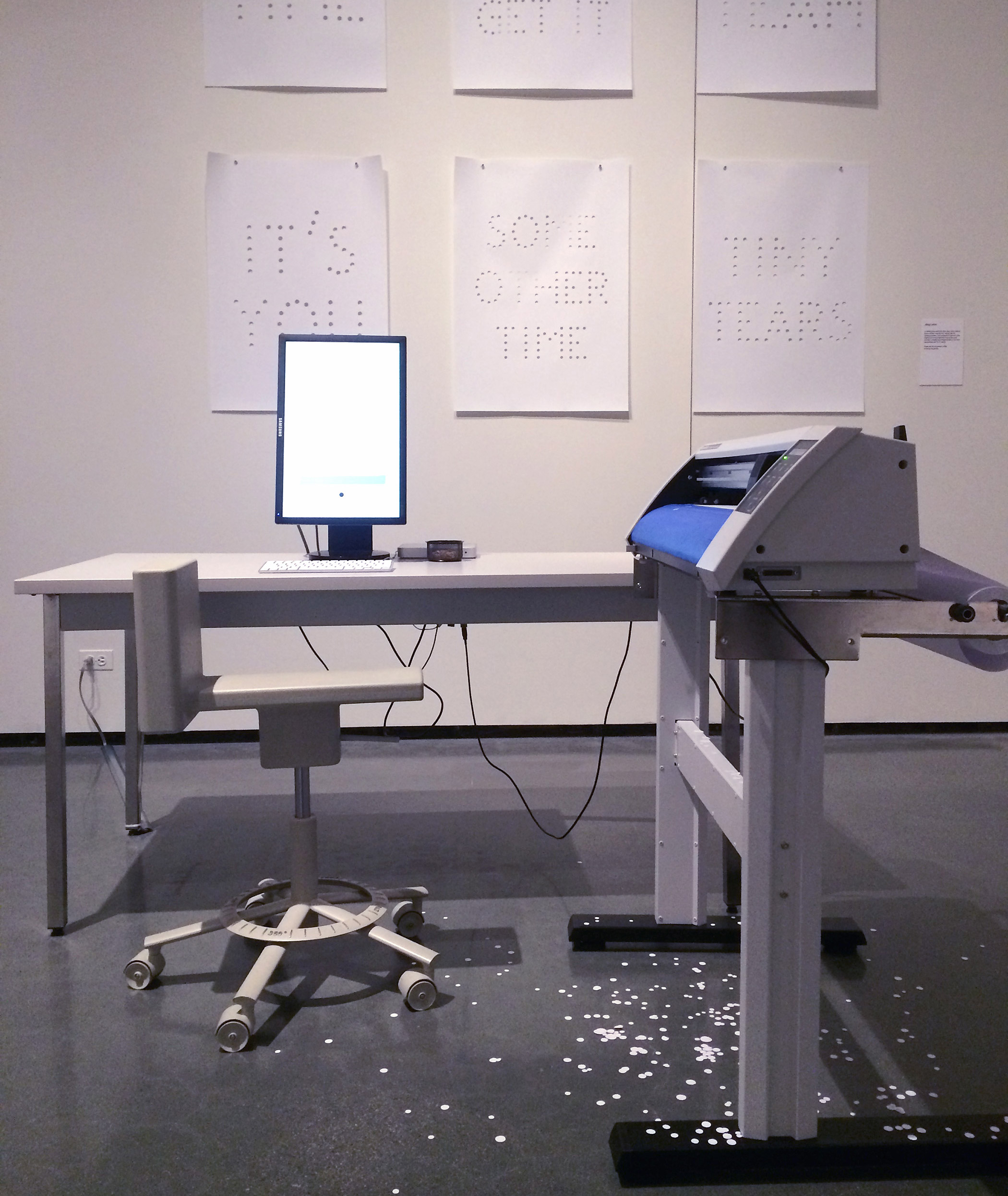
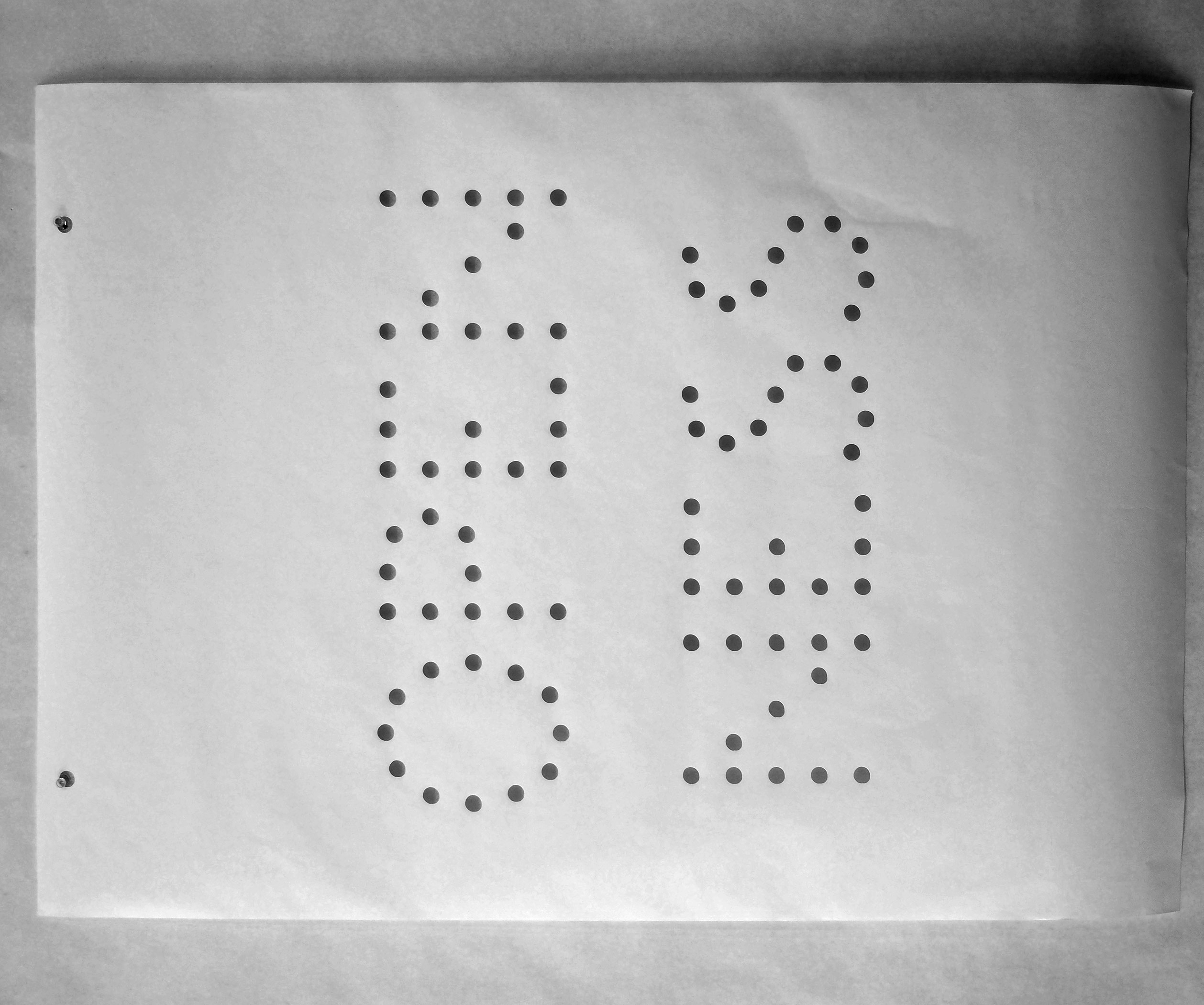
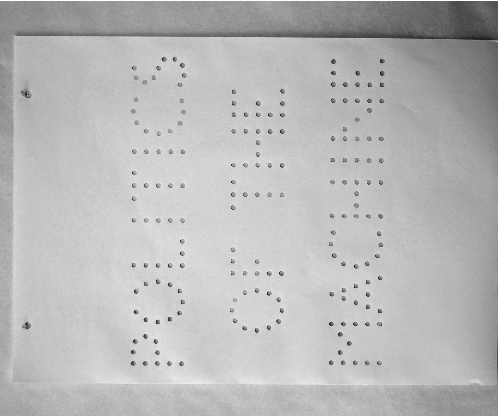
I’ve noticed that works like Hektor, Empty Words, Moving Picture Show, are all very open about revealing the mechanisms of the tools themselves. Is this an intentional choice, and if so why do you think it’s important to do so?
Yes, that’s very intentional. It has partly to do with this interest in gestures and the urge to unveil and disclose them, but it goes further: It is really important to me that the technology I use is displayed as something transparent and open, not magical, closed and seeming superior. This fascination goes straight back to the openness that I encountered when exploring the Commodore computers in the 80ies. They were open structures, almost begging to be tinkered with, very unlike today’s shiny touch sensitive glass surfaces of our smartphones and tablet computers, that pretend that the technology is not there, and offer no interface to directly programming these devices. Giving my works this transparency and openness helps people appreciate them rather than being controlled or frightened by them. And it is the very same motivations that cause me to engage in the creation of open-source software that is built to teach programming to designers, such as Scriptographer.org or Paper.js
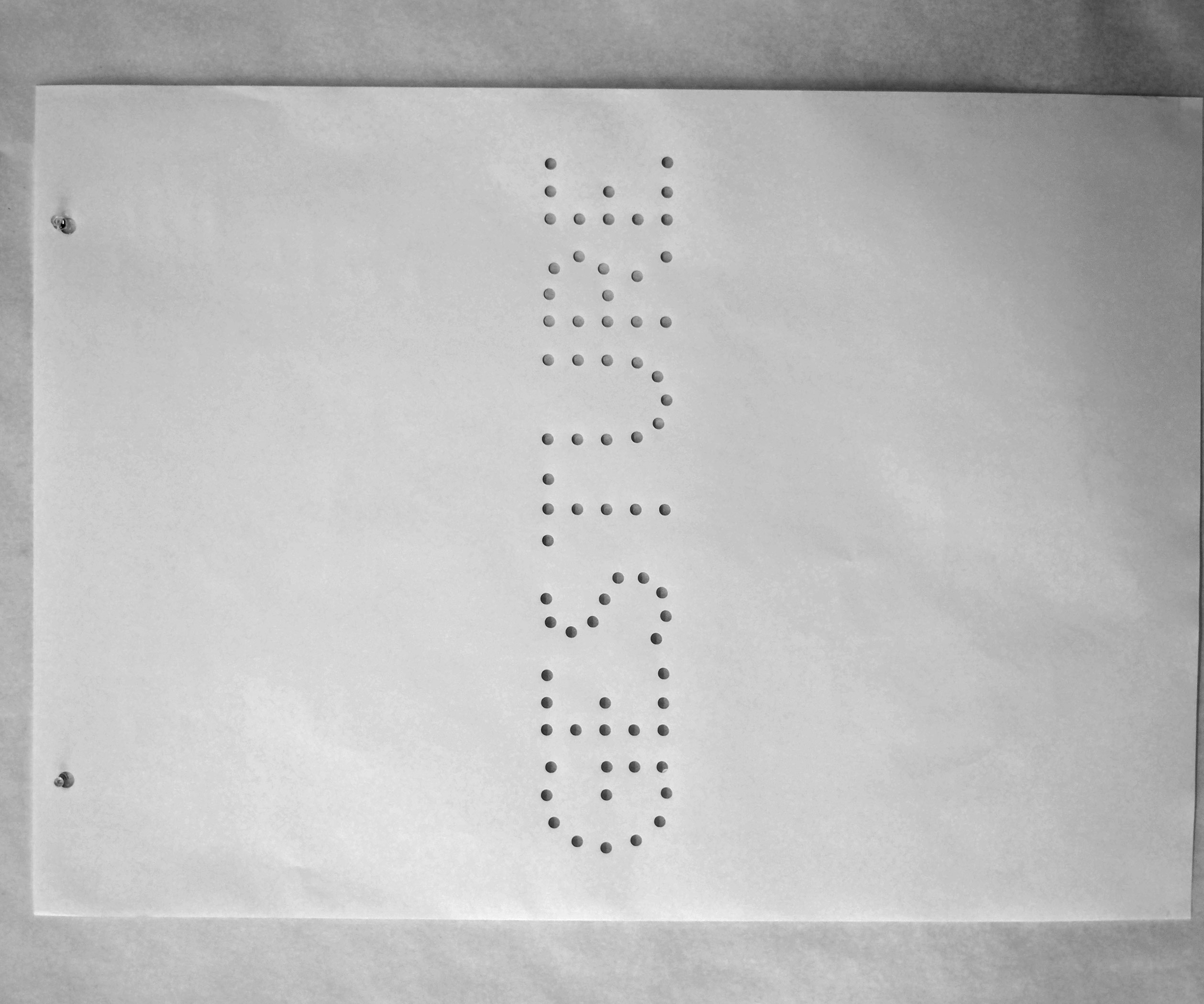
Your use of the Speed-I-Jet seems to really emphasize the idea of instant reproducibility, both of content and of form. What draws you to this act of repetition? Is it just a byproduct of working with machines?
It’s the same interest in gestures again. I love what happens with the Speed-I-Jet when someone uses it to print for the first time. You hold it like a pen, and move it on a line, but you are not necessarily the author of the letters that come out of it, yet you give it a personal touch, by the way you move and control the printing head. The boundaries of authorship get blurred as you become part of the printing process, basically replacing the parts of the inkjet printers that take care of the x-y motion. It’s this beautiful combination between a human gesture and a machine gesture that Alex Rich and I felt was worth celebrating with a modest piece of work.
Some of my first exposure to scripting was through Scriptographer. When you announced that you would no longer release new versions because of Adobe’s attitude towards API’s, I felt like the design community lost a valuable tool. Were there other considerations to ending development on Scriptographer besides Adobe’s stance? Philosophically would you rather build a tool for an open environment than a widely used closed one?
It was really hard to come to this conclusion, and I’ve been sitting on the fence with it for years. But with each new release of Illustrator, rather than spending time on new features and ideas I just found myself patching and fixing newly introduced issues and incompatibilities. As a result, all the fun was disappearing and I didn’t enjoy working on the project anymore. And while I initially built it to run projects like Hektor, Viktor and Rita, and to teach programming to visually thinking people, I had less and less time to actually make things with it by myself.
But I knew that the core idea was right, and that this kind of environment is exactly what it takes to teach scripting in a design oriented context, so I felt it was best to move on and put the energy into Paper.js instead. I am just about to start working on a graphic user interface for Paper.js that replicates some of what people came to love in Scriptographer, and I am excited to be able to use this for more teaching soon. I think eventually it will get to a point where we won’t have to look back anymore, because the new solutions will offer more openness and freedom than a corporately encapsulated solution ever would.
Now that the digital and mechanical tools you incorporate in your work (i.e. the die-cutting machine in Empty Words, or even a browser) are becoming proprietary objects, are the politics of the companies that create these tools something you consider when creating your work? Just like the shape of a brush creates different forms, do you think the intentions or desires of the companies behind these tools shape an artist/designer’s final output?
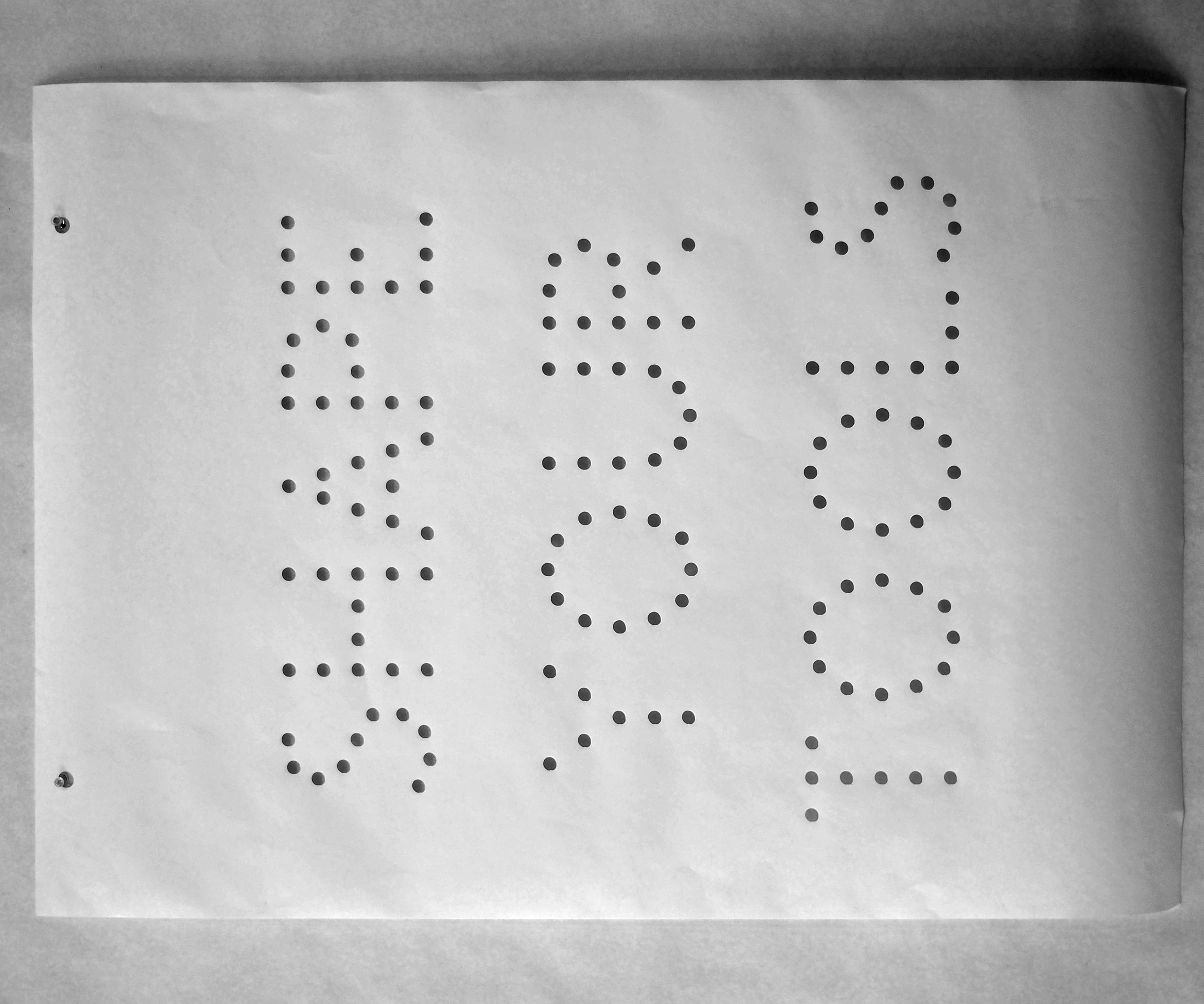
Yes of course each tool has an impact on its user. The quote “We shape our tools and thereafter our tools shape us” comes to mind, which gets wrongly attributed to Marshall McLuhan, while it was actually by Father John Culkin, SJ, a Professor of Communication at Fordham University in New York and friend of McLuhan. With the gently changed vinyl cutting machine, the politics of the actual machine indeed played a role (not a die-cutting machine, which is another process). Alex and I thought of vinyl labeling as a rather uninteresting default way of putting letters on a wall, similar to the use of color laser printers, or 3D printing, which is now all the rage whenever somebody wants to make a physical object. It felt good to give such a machine, which one could argue has killed the sign painter, a new more friendly meaning.
There is a similar context to Moving Picture Show, which only became feasible through the extinction of 35mm film as an actively used medium for film projection. The laser subtitling machinery used to make these films would never have been available before that, and will soon disappear completely. The moment was just right to make a piece of work that speaks of a transition caused by technological advance, completely transforming a whole field of visual production.
Ben Pieratt talks with Lukas WinklerPrins
Ben Pieratt is a designer known for projects like Hessian and SVPPLY. He has been through the ringer as a startup CEO and came out the other side with quite a bit of personal drive and focus, which has lead to his most recent studio, Internetland. He sat down for a skype interview with Lukas on March 13, 2014. This is an edited transcript.
Thank you for joining me. I’ve been an internet fanboy of yours for a little while but other people in the class don’t know who you are. So if you could say who you are and what you do…?
Noooooo
OK, start on what you’re doing this year then, internetland…
No, I didn’t mean to be rude, I can do that. Could you give me a frame for this a little bit? So I can be as useful as I can? tell me a little more about the class and the context of this video.
This is for HTML Output at RISD here in Providence. It’s in the graphic design department taught by John Caserta and the way he presented the class is that we’re doing experimental web design, experimenting with what the browser can do and what the browser is as a tool.
That’s rad. That sounds super cool.
It’s very open ended and a lot of it is just taking things from formal graphic design and implementing them in the browser, as well as a few browser-specific areas. For the browser, both its output and input is dynamic—and there are glitches or things that are unique to different browsers across different systems. That’s all stuff we’re researching through making.
Is this class available to all majors?
It is! I’m not even at RISD. I’m a math major at Brown.
Rad. Can I see stuff from the class?
Yeah, absolutely. I’ll send you a link in the little chat box here.
You probably already sent it to me, sorry.
No worries. That’s the URL.
OK so a couple months ago I was a guest speaker at a user interface class at, I think The New School, and I gave a summary of my work in the form of a “history of interfaces.” So I showed examples, a chronological view of my portfolio; I only showed the interfaces of a particular project. So I’m Ben [laughs]. I’m a designer. I was supposed to have graduated from MassArt in 2004 and I’ve mostly worked as an independent designer since then. I had a small studio for a handful of years with two other guys. One developer and one other designer and we did websites and logos and that was called “Fwis”.
That’s when I first found your web presence, through readymech.
Oh really! Cool, that’s old.
Buncha years ago
Readymech is from my college years, part of my senior thesis. Actually that’s not true. My senior thesis was sci-fi book covers. Readymech was work on my portfolio. Anyway that was 2004. And then I worked on a couple object jobs to keep bills paid. Tried to work with fwis but never could. I have a really big problem working for people. I just don’t like it at all. I get depressed after 6 months so I’ve learned just to not do that. One of the projects I have launched was called SVPPLY. It was a retail bookmarking service. An image bookmarking service but the brand was retail. That was really interesting; it was my first start-up but I didn’t know it was a startup at the time. And then we took venture capital funding for that and I learned a lot about investors and money and that kinda thing. I left SVPPLY around the time it got bought by ebay in 2012 and I’ve been an independent designer since then. Now I do branding and product design for early startups; doing interface design and I do a lot of company naming and logos. And the interface and a lot of general product strategy—what does the product actually do, and a lot of project therapy.
How the product interacts with its visual language?
No: these founders, the people who start the companies, are usually doing it with someone else and they have a vision for where they want their product to take them but they don’t necessarily know how to get there. They have a lot of ideas but product therapy just means listening to them. Figuring out what they’re actually saying, reducing that down to a series of buttons.
OK.
There’s just a lot of interpersonal skills. It’s just funny because people are crazy about what they want. So that’s what I do up until now! Now I just started this thing internetland. That’s my studio now.
I really want to hear about that. So I know you started the project at the end of last year right? This yearlong shindig?
[Laughs] we’ll see about that year thing.
I want to hear you define it. I know it by name, Internetland v. Print. You’ve done so much work with the web and digital product so where’s the print side coming from?
I made an agreement with myself when left SVPPLY. SVPPLY was really tough; I was CEO of SVPPLY and the designer and I have all these expectations for how to do and I did really badly with a lot of the things that I was supposed to be good at; in large part because of the things that I failed at it wound up having to be sold to ebay. So when i left SVPPLY I made an agreement with myself “I will not bring in any partners, I will not bring in any clients bigger than what I can handle on my own. I won’t hire anybody”. And then also acknowledging that I shouldn’t be doing any work that I didnn’t want to do. I just HATED doing all the CEO stuff—handling all this money and board meetings and laying out agendas for a team. I was convinced that I should be able to do it and I hated it. I spent all of this time just doing something I hated. So I decided I’m not doing that anymore. Not only did I fail but I was miserable. Once I left SVPPLY I reduced everything down to a very small career. I’ve been trying to get my career to the point where I’m only doing things that are interesting. So internetland has emerged from this notion that I can only I’m trying to do more. as I get more focused on what is interesting to myself, its more and more close to art. So internetland was supposed to be an overarching plot that I’m inspired by the internet and I love the internet as a concept this notion of world connection is something that as a designer I can feel good about contributing to. I work more in Adobe Illustrator than anytihng else. I can draw kinda. I can’t paint. I can barely work with my hands. But in Illustrator I feel very loose. It is really my native medium. I’m acknowledging that that’s OK. So I’m trying to embrace digital, vectors, the internet, embrace this embrace towards becoming an artist. Internetland became that. I had tried to raise some money. So I’m doing this project called varsity bookmarking, a magazine, and lookwork, an rss reader, and a couple things I’m working on and they’re under the internetland banner. And I had tried to raise some money and that was really hard I just didn’t enjoy it at all. Trying to raise some money for this art show I want to do. [laughs] I’m talking a lot. The print thing works into all this. Internetland is now my digital direction. It’s me trying to get very smart about how I do work. And the print part. I don’t know. It’s not going to be whats you’re expecting. I’ve stumbled onto this technique of taking magazines/books apart and on the output of that what I believe to be artwork. [Laughs] And it’s print. Like I’m working with old magazines. And I have a lot of these pieces now. And at the show they tie into my digital work in some interesting ways.
OK
yeah I mean there’s… you have to understand. like I can try to explain the work but it’s going to be me talking a bunch more.
You don’t have to explain the work, but I am curious about your process on the work. I mean if are these like collages of the magazines or digital manipulations of their content? And then you said that it informs your digital work? Or can come from your digital work? I’m curious what that looks like. Is it something are these forms you’re making in both digital and print? Or some and translating to the other?
I’m gonna try to think about your class for a second. It’s browser based?
It’s browser based, but our end goal for the class is to have a book. So we’re talking a lot about process of going from browser to printed page. Uhm. Like for a kinda homework assignment a few weeks ago was bring in a bunch of tabloid-sized prints that are straight “you’re in safari, seeing a page you hit print and see what comes out”. And seeing what comes out the way it looks on the screen and what doesn’t and just as a conversation about why that happens. Color is especially something we’re talking about.
I just want this to be interesting. Let me try to speak relevantly to some of the things you just said. I guess when it comes to internet and I think of print and I think of digital and browsers mostly I think about how print is dead and how as screens get better and better we’re just going to… books are gonna be around for a long time and they’ll be beautiful and they’ll have their own advantages, but screens are going to get more interesting for a while. The thing that really sold me is the retina display. It’s so nice to having your own work on an iPad that it approaches having painted something. It’s so vibrant and so crisp that my suspicion is that it contributes to digital artists embracing the screen as its own medium. When I’m doing internetland it’s fun to think about things native to the internet. I only work in RGB space. The colors I love most are the ones that can’t exist in CMYK. If you have that color space like drawn around each other. Pure RGB.
I know what you mean. Fill up the red channel. Nothing in the other two. CMYK can’t do that.
With the saturation blown all the way up, you just can’t replicate that in print so that’s very interesting. At least for me. All the work I’m doing now is like I’m trying to do this thing where it looks good on both phone and desktop without changing anything. The scrolls I did for IvP are these giant things you have to scroll through them no matter how big your screen is. Ideally you’re looking at them fullscreen on both phone and desktop so that the colors always blow out. The point with me for scrolls is there are opportunities unique to digital you can’t do in print. Exploring those is there the more interesting things are happening. New, completely new. It’s our turn to do some new stuff.
It couldn’t exist until these uh, retina displays. Makes the color more material, that’s how I feel.
Yeah, it’s like
But a truly native
It’s like I didn’t have that before and now it’s like “eh” and inversely what’s interesting to me about print is that... well, if you go to pieratt.com and scroll down there are examples of the print pieces there. I just don’t really call them out as such. It’s a bunch of spreads. Digital has become so advanced and typical that it feels like art. I can put this magazine piece on a wall now, and even six years ago I wouldn’t have thought it was beautiful but now the patina of the shitty paper feels like something legitimate. It has a character to it that is somewhere for display. For that reason the artwork I’m doing you can see these examples. If I did screenshare would you see them?
Is that how you pronounce your last name? Pieratt?
Pieratt I actually don’t care how you say it.
I’m looking at them now
So the the thought there is that old stuff now looks cool.
yeah or that
Print is dead so print is art. That’s what’s driving the project.
Or now that you’re developing in a purely digital environment the prints gain a certain quality.
I got really lucky. I feel as though I’m doing these magazine pieces and they involved taking magazines apart and there’s a lot of output. The thing that’s somewhere between… what might be interesting. The thing. The thing that interests me most is taking huge amounts of noise and filtering them down into outputs that are beautiful. SVPPLY was a really harvest. Harvesting of an emotion of want. Like “I want that thing”. And now there’s a place to put that. Through some basic code, which is stuck on to a person’s brain through the brain. This brand represents want. Every time you want something, click this bookmark to put it over here. That was our first experiment, when I realized this notion of building design that takes chaos into account and then tries to use best practices with it to make something great. With SVPPLY the thing I was most proud of is that no matter who signed up, within the moment of having a profile, you’d have the most attractive profile that you had anywhere anywhere. Anyone on svpply looks good. That was something with having good whitespace, which at the time was pretty cool. Now with varsity bookmarking, this interview project, we want to imagine if I took a .jpg answer and I embedded that in the page or a youtube answer and you have rich media interviews. Just through someone having answered with links. And that’s what I’m building. And that’s just through answering the right questions. Anyone will be able to take the interview. And at the end of the interview they’ll have their output that makes them look really cool and smart and interesting. All of this design has to fail gracefully; you have to assume some stuff isn’t going to go in right and text isn’t going to go in there. You have to design so that it… well, I’m repeating myself.
For the purposes of our class hearing these thoughts is relevant and hearing about your process for thinking about the print is relevant. OK, I’ll talk about myself a little bit now, I’m a math major and I’m interested in chaos in a formal math sense so I’ve been playing a lot with random generation in the browser. And it starts with literally using javascript to generate random numbers to assign random values to properties of shapes and text and eventually I’d like that randomness to be meaningful. Take it from a datastream somewhere. But I’m really enjoying the process of playing with how much control can you give to the system and still kind of get something meaningful or at least aesthetically nice out of it.
Uh-huh.
It’s a lot about playing with rules. How many rules do you give to your system and then you allow the system to go? And produce that output?
Right.
And the browser itself works really well for this. It’s a constrained environment. How much HTML programming is just hacks that look pretty good all together? So it’s setting rulesets. I’m rambling. I’m really interested in that.
That’s cool to me. I would suggest the rulesets in the scenarios I’m building up well the rulesets are questions, so you just find what is allowable simply by the question and narrow down. Rules you’re applying to the screen, expressed in the form of a question. One of the questions on VB has been “what have you watched repeatedly?” so it’s trying to be more interesting and less linear than “what’s your favorite movie” I’d love to have answers as GIFS or youtube videos or links to IMDB. I don’t really care but when someone asks for a favorite.
They have a running list.
Yeah, like a cache. They pull from a generic cache of an answer. It’s identifiable with who I am. We’ve all seen high fidelity. [Laughs] Anyways I’m trying to decide: in theory you’ll in fact remember what you love just by having watched it many times. But then that couples out with the other questions like what are you listening to right now.
You’re kind of channeling…
Channeling their experience through shared rulesets… yeah.
Does that echo any in your print work? Are there rules you’re working in there or have established for those pieces?
The way it works is half of all printed materials, anything bound… is either a signature binding or a perfect binding. As far as I understand; I’m exaggerating. A lot of things are just glued.
And then glue it together.
You’ve got your perfect binding. Other people use broadsheets. Life magazine is one big broadsheet and you stitch down the middle and then fold it. When you do the signature binding you have to rearrange the content into a new position via a process called imposition: you put page number 2 as the same sheet as page number 98 if in a 100 page book. Lots of magazines, especially older ones, and lots of books, historically and currently work around the signature binding basis. When I realized this I was doing some collage work, somewhat physical, I don’t want to lose all my hand skills. Anyway I reduced the process to: you open up the signature and you go through the spreads as full spreads! and every once in a while you wind up with these juxtapositions never meant to be seem but they share the same physical space and speak into each other in a new truth in a “whoah that’s amazing they’re beautiful, interesting, funny”. The screenshot on pieratt.com is following some examples of output. But follow to my garage that’s got a big stack of output I call my exhaust all the pages from the books. The history of print, really.
Where are these materials coming from?
What’s great is I live in northern New England and there’s antique stores everywhere and this massive market up the road from me, so I get stacks of Life magazine at a time for $10 and tons of books. There’s a $1 book room down the road with giant art books. I live in the perfect area for it. I’m slowly going through it. I haven’t framed anything but some of the work is beautiful. So in that sense you’re going through like I’m not inventing anything new it’s all found objects, but it is the curatorial eye. There is a level of selection involved which is the same thing that grew SVPPLY which is or book cover archive as well. Honestly I’ve never really understood the role this type of curation plays in my own work but I do know I’m picking out really good work that takes certain levels of… there’s plenty of spreads in the print stuff that are attractive, they look good. But there’s very few of them that really speak and say something to me. And I think it’s harder to identify those to some degree. Anyway with SVPPLY the front page, I controlled the front page for the first year. Nothing would go on the front page, which was important for building the brand the site was supposed to appeal to. One of the problems of SVPPLY is that I actually hated shopping; the whole team hated shopping. There were 8 guys on the team and none of us liked shopping. That’s really a problem when you’re building a product and you don’t like using it; you don’t learn anything from it. It can’t speak to you because you’re not trying; you’re not enjoying it. So that was one of the problems… we didn’t know how to grow.
That’s great. I think the your role in your print process is the curatorial eye and the establishing of the process. That’s really what I mean by you set a rule set, you’re buying from this market, you’re looking at the spreads and then you see what comes from it. I think that’s awesome. So you said you’re hoping it still happens? you’re on track?
I mean when I first landed on this print physical art stuff i just flipped my lid like it was so exciting. It’s exhilarating, like I invented my own personal tumblr out of this print. And to me the output is beautiful and it will also make me money eventually and I also enjoy doing it. So it’s just the perfect storm of awesomeness. And I notice these similarities in my web. The thing about VB is that it’s going to be open; I’m calling it a magazine but it behaves like a social network.
Mmm
And it will be the first social network that you can go through linearly, that encourages you to go through user 1 to user 10,000 in a line. And because of that there were some interesting interface opportunities. I can just screenshare… there were some cool interface opportunities of putting two people next to each other that had no goal in being next to each other and then letting their tastes speak to the output of how the interface looked.
How many are on there now? 3?
Just 5. But I’ve been redoing it for a year now, almost a year. I’ve not expected it to take this long, it’s pretty frustrating. But I think it’s going to a good spot. If I can find the file I will show it to you.
[Laughs] Okay.
Wow good stuff. Uhm. Sorry, watching me browse my computer is thrilling. Give me a question or something
I’ve a question. John Caserta, the professor for the class, said “oh you should talk to him about if...” so you said Illustrator is your native tool but you’ve been working in the web for a while. How has browser evolution affected your work?
It was interesting when I was at SVPPLY 2004-2010. 6 years I worked really hard I was really into design. I hated working for people so there was always a lot of hunger, I worked really hard, and then SVPPLY hit and we got funded and then I slowed down a bunch and I had a lot of responsibilities that weren’t design related. For about two years I was distracted both by questions about where the product is going but also just because I had so many other things to do that weren’t design. When I went back to design in 2012 at the end of it I looked around and realized that I had I got back into freelance fine and looked at the work, which is a year and change old, and the work was not good. It was OK—I was still an OK designer but it didn’t look contemporary. It didn’t look like it was at the forefront. I had lost my style or something like that. It was interesting and it was depressing and it was a little bit scary. But I worked through it and over time I’ve redeveloped a strong style for myself. Style to me is output of your own interests. So don’t be afraid of having a style because it’s an expression of what are the components of what you’re working on you find interesting. And to do that you exaggerate them, you focus on them, and then you get like all this stuff that hasn’t really been there before. The time I was at SVPPLY well, that’s when responsive hit. But with responsive your website has to look good on mobile. Tt’s hard to get your head around that to the point you feel creative with it. The limitations that it presents and the opportunities that it presents… You have to have done a good handful of sites before you start to feel comfortable messing with the formulas for it at all, the formulas that have been established. Anyways, knowing that I wanted to stay contemporary and relevant and be excited about my own work I had to get good at mobile. And although I don’t like the app store at all… well I mean I [laughs] use the app store. I need it for apps somewhat but I don’t like it because it’s a closed system. I love the internet, I love the web, but I don’t like the app store because it’s filtered through Apple’s editorial . It’s crazy. I don’t think something can grow naturally on the app store. So I’m not interested in doing apps but websites have to look good on the web. So what that’s meant is that everything gets really big and everything becomes one column. And the moment you break something into two columns it looks old. That’s what I have discovered in my own experience.

That resonates with me to some extent. it’s instantly harkens back to the limits of the page, and the page is old.
If you want your thing to look new make it one column and make it big. There’s a lot of refinement to go on that, moving in that direction. And this whole embrace of RGB… SVPPLY gave me my mission in life. It made me aware of what design could achieve like SVPPLY was a design experiment. I didn’t even like shopping; it was a market experience going through the mechanics of how ffffound used to work and apply it to retail and make it into an exclusive brand and what would you get? I suspected what we would get and I was kinda right. But what it taught me is that with a good idea and some insight… I was a designer now being charged by investors with disrupting a 50 billion, whatever it was, trillion-dollar market of shopping and retail. We were like “oh we’ll be the next 5th avenue, of the internet” and just having those conversations gave me a lot of interest in what the internet was capable of and liable as an individual.
I think the scrolls are great, I’m very fond of them—I made a scroll of my own actually for class. An homage. Imitation is flattery right? I think that’s what web-native is right now. Full-width scrolling as the interactive gesture. Something like that.
Something like that.
That’s more or less it for what I have straight-up questions! But I would like to see the document you were working on for varsity bookmarking.
Oh, sure. I couldn’t find the right one.
That’s the internetland logo, right? Behind you? Rhe rainbow?
Ah, yeah, kinda. Yeah, yeah it is. It’s cool. It’s for a client. The display itself is the client called “electric objects.” He wants to bring the internet into the slow-time, make it something you can appreciate as an art object. So it’s an internet-connected display and he’s pitching it kind of as an art object.
As a passive display?
Yup, so it just chills on your wall and you can pull it up through mobile or websites. It’s just a community and all open.
Electric object?
I feel like it would be so much more fun if it was interactive. Well, I didn’t start it...
I’m just trying to wrap that up, the electric objects stuff. You know my kids are probably going to be coming up through here pretty soon.
We can wrap it up.
The snow was intimidating today.
We hardly had any here today in Providence.
So you’re looking at my screen now?
Yup, yeah. Peter mendelsund.
This is an old Illustrator sketch file so it’s not going to make a lot of sense. Varsity bookmarking is going to be an interview that anyone can take and the answers are all URLs. So in this case Justin Ouellette’s interview, and that would be interview 1 on the left and on the right is interview 3. So you see the composition is trying to work with in the collage elements. But i’m struggling with this for like a year trying to make it something that felt legitimate and not too coarse and I got into a lot of problems with page load.
with all the included media?
No I don’t know I think it’s just trying to load three different profiles at the same time and it does it quickly and wouldn’t lag on you and it took a lot of work. You can see the images are embedded in rich media interviews.
There’s that RGB blue.
This is the beginning here. Now if you look at the new electric objects…
Oh cool.
The new electric objects logo. This is what Illustrator canvas looks like when I’m working on it. All interface sketches.
There’s one student in the class
The thought on this one, this is all the same thing. It’s where the type size works well on both phone and desktop. All one type size, font weight, and the only difference is underline for links. and the padding is 40px between all elements on the vertical, 20 on the horizontal. Supposed to feel like a giant database. You can see here’s the same thinking.
It’s actually really cool to see it all zoomed out. I was saying there’s a student in the class who’s playing a lot with stock objects and manipulations.
That’s cool.
The buttons that Safari has a certain style for, Chrome has a certain style, for whatever. But also sprite sheets: these kind of visual elements that you’re not supposed to see all of at once.
Uh-huh.
Whatever the media’s supposed to select you see this and then you see this like to animate it or something like that. And seeing your Illustrator map feels like that: it’s like I’m not supposed to be seeing all of this this. Whatever venue through which I’m going to see it is going to curate what I see.
This is the art view.
Object, users, and then your own profile, if you want to get one of these setups or something?
Anyway. That’s what I was doing today anyway. got a peek at the interface design.
Thank you.
Dan Michaelson talks with John Caserta
Dan Michaelson is a co-partner in Linked by Air. John was joined by Catherine Schmidt, Evan Brooks and Michael McDermott for the interview on February 22nd, 2014.
In this class, we are dealing with certain areas of the browser as a tool, particularly as a production tool, severing off the consumption or interactive side. What is the browser capable of? You can make things in it. You can also receive things in it. What is the browser? You work so much in it and your work seems mostly browser-based in some capacity, whether it’s serving someone a browser deliverable or not. How do you see it or use it in this day and age?
In our studio, and definitely in my class which is called Networks and Transactions I’m almost focused on the opposite actually, on the idea of the browser as the end of a network that’s reaching out, and on HTML as not only a formatting language but also a HTTPS protocol that really is all about distribution. But I think your class is great and I think that that very distinction suggests the need for filling out the other side of that equation as well. I think browsers are rendering engines and they’re increasingly powerful ones for sure. More and more you can make anything in HTML and CSS, especially if you’re not worried about legacy browsers and stuff like that. I also think that the inspector is an incredible tool for manipulating a design language and an interactive language. Are we talking about the browser just as a rendering engine, or are we also talking about the browser as an interactive platform, even if we’re still ignoring the network? You can tinker with the code behind the rendering or with the code behind the interaction, even while the interaction is actually going on. That itself is a paradigm that doesn’t hardly cease to exist anywhere else. You can’t do that with a car. You can’t open up the engine and put the fan belt on a different flywheel while it’s still moving, but with a browser inspector you can. That’s an amazing way to think about design: as a machine, but one that you can manipulate in real time.
That taps into another question that Professor Lucy Hitchcock said after your lecture, “there’s really something happening in our field where there are the formmakers, whether its graphic form or what have you, that illustrate concepts and ideas, and there’s the systems makers.” That split struck me because, on one level maybe that’s true, maybe that’s obvious. Could you see our field as made up by those camps, and if so when did that begin? I think when you were a grad student around 2000, you probably have seen much of that split occur if that is indeed the case.
I think that’s a useful distinction. I try to find a way to talk about systems as form, so if we’re trying to predict the way that people move through a space that movement in us is also a form. I think graphic designers have always been comfortable talking about things like rhythm and color. It’s not a problem to think about movement as a kind of form in, for example, a color theory class, or when discussing Saul Bass film titles or something. If you are talking about the speed or the qualities of how people move through a building that you’ve done the wayfinding program for, it seems like that’s an aspect of the form of that wayfinding system. Similarly, if we think about the rhythms or qualities of how a person navigates their way from section to section of a website, that’s also a kind of form, just the same way you might think about the rhythm of the hierarchy of a complicated instruction manual as a kind of form.
And it requires the user to have that play out you think? Or is it actually inherently there.
Yeah, I think that’s a good point. I don’t think it’s new honestly. It requires the user to play out, but isn’t that true if you think about a reader as well, and then ultimately when you’re designing typographic hierarchy? I think we got used to thinking about those things as being things in themselves, and yes I can see the typographic hierarchy as an image on my retina, but actually it’s always been about the reader. I think there were some really great systems thinkers in the 50s, too, and I wonder whether for awhile we forgot about that and started to think of these beautiful finished compositions. The signifiers of “good design” took on a life of their own. Form is always something that is serving a function, and function is something that is completed by a reader or consumer or user, and we think to the experience of those things always as a part of the design. It’s not to contradict Lucy’s point at all, but just to say I don’t think it’s entirely new, but it’s an important aspect about how to think about Graphic Design. Also, I would try not to describe it as a formless idea (some people maybe would, and it may be useful to talk about drawing a distinction between content and form and experience and form) but I actually think it’s nice to think about what are the formal qualities of an experience.
I’ve been looking at the Graphic Design Now in Production catalogue and Andrew and Ellen and Jessica Helfand are coming to do a panel in a month or two. The show’s coming here, and I think its been 3 years since the show went up, and it was probably curated 4 or 5 years ago. Most of it is graphic form/ graphic art. There is something to chew on. The Lust Poster Wall is there because it produced a wall full of digital posters and so I wonder, were you comfortable with the way that show was curated or worded, even the sections like “information design,” and “posters.” If so then what are your thoughts on it now as far as how it describes the profession, because Yale still describes itself as there is Graphic Design within the School of Art, so you share that term with the Walker, and the Cooper-Hewitt in a sense.
I don’t mind the term Graphic Design at all. It’s such a nebulous term. Like I said, I think it’s a pretty open-ended term to describe ourselves that way. I think that visual form is really important too, and people might disagree about whether our work is beautiful or not, but it ought to be. We’re trying to make beautiful work, and we’re trying to make beautiful outcomes, even if that work is sometimes completed by other constituents. I don’t necessarily think that the focus on two dimensional form is misplaced. You can imagine in a more progressive way to categorize work that isn’t so much about genres of finished work, but is about genres of process, or genres of functionalities, or different kinds of systems. Is it content management systems and real-time applications? That’s a funny distinction between functionality and visual design that we get caught up in sometimes. It is hard for us to capture the beauty of our work in a single screen grab, and that’s something that we struggle with in a practical way just working on a website. Right now we decided we should, on the homepage of our website, be a little bit more marketing focused and feature 4 case studies. We just made it quickly, but right now these 4 studies lead with just a screen grab of the homepage, which is not particularly compelling. I think those websites are very compelling websites, but it becomes more compelling as the series of screens accumulates through your experience moving through the site, even just it’s more compelling to scroll down than it is to just see what’s above the fold for example. So to address all those questions as to how do you distill an experience into an image, I don’t think its a question of whether that experience is formally beautiful or not. I would argue that it is. As visual design, how you take a crop of it, either through time or through space, is tough. To your point, it’s just a fact of communication and our salesmanship that you do need to find ways to summarize, give an elevator pitch, [etc.] There should be a compelling screen grab that can tell the story of whats good about a website, and maybe that’s also part of being a good designer is that it has that level as well.
How does Zaron play into this, the all-seeing eye?
Its a reaction to that, in that if we could just capture every single state of every website that we ever made, then that would be a way to more accurately represent what we’ve done as it has unfolded over years. Another cool feature of Zaron is that it can capture what I call “comic strips” of an end-user’s use of a site, so if you are a web designer, or if you’re organizing a urban game like Midnight Madness, the tragedy is that you never know what people are actually doing, what the users or players are actually doing with your thing, and that’s what its all about. If you make a poster you pretty much know or you don’t care looking at it what their experience is, but it’s still fun to go out to the bus shelter and see people looking at your poster, but theres nothing surprising. It’s just gratifying. With a website you want to know the paths people are taking, or with an urban game you want to know how people are stumped, how they are having fun, which way are they going and how are they using it, but you can’t be there. In later iterations of Midnight Madness, the urban game, technology has advanced enough that we actually could be outside organizing the game in real time, so that did allow us to get some cross-sections or glimpses through the progression of the game. But in earlier years, we would all take turns. We would be holed up in our game headquarters, and if there was a part of the game that broke everyone would be dying to be the one that would go out and fix it because it would give you the chance to cruse by and see players doing their thing. Once we had this mobile technology and we could have our game headquarters be in a park, the first thing that happened was an enterprising team stole our packet of clues. They said once we were actually among the users that, of course, the users can mess you up. We became more rhizomatic and flatter, but that’s also with the corresponding loss of security. It became a pure network with all the plusses and minuses of a system like that. So getting back to Zaron one thing we do know the sequence. We can’t really spy on people’s screens, and it’s not really possible in real time to know what people see on their screens, but we can spy on the logs of our server, which is a centralized thing but we do. You can track a user session and say the user number, which can be an IP address, but usually it’s just a long hash of their session ID which is just an anonymous random number. We know that they viewed this URL followed by this URL followed by this URL followed by this URL, and then what Zaron can do is render a screen capture, not of their screen which is not really possible, but of Zaron own screen but of that URL. What that produces is a comic strip of thumbnails of all the pages that one user viewed in sequence. Then you can see a series of those comic strips of many users, the sequences of pages that they saw. That becomes a pretty neat way of visualizing how a lot of people use the site more or less at the same time. Even moreso than looking at analytics or something like that which shows that as a chart. Being able to see that (even though its a simulation it’s something close to what they saw) is a pretty neat situational awareness.
So you’ll see the exact image that was there?
It can differ a little bit because we’re not using their browser and for various other reasons.
There certainly is a trend on using user data, probably in a different way then what you’re talking about, analytics or what have you, to make design decisions. Obviously when you take that to the extreme it seems nuts, but you’re doing that in a more thoughtful way. How does that influence the iterations that you make and how it plays into things like risk taking, client expectations and then advancements in the browser and technology, where maybe you can do something else now so all that knowledge doesn’t apply?
Our usual approach is to make a guess about how users would behave. Also, I think it’s important to make a stipulation as to how you want users to behave, and not to just be driven entirely by what users think they want, or what they already know that they want based on their experience to date. I think it is really crucial that design be progressive. You are making the feature so you design for that, but then you look and see if it worked. If the uptake of your new feature isn’t what you wanted relevant to the importance of that feature then you change it.
Does it actually match the hierarchy? So do you want 20% of viewers to actually be playing with this thing? Do you have an image in your mind? If you take the Whitney for instance, everyone should know the Biennial and should hopefully engage with that content in some way, but it’s likely that 30-50% would want to know something like visiting information. How do you know if the predictions were right? To what extent is it that the design’s fault or success versus what was going to happen anyways?
If you are talking about, lets say the Biennial compared to the opening hours, or even something like the Whitney’s permanent collection online compared to the opening hours, I think there are different kinds of information that need to be conveyed. We would assume that a lot of people wanted the opening hours, so we would go into it with that baseline assumption, even thought that’s not the most exciting or interesting thing about the museum. We make assumptions about what the website is for, and one of the things we know that its for is for people to find out the address of the museum, so that goes right up at the top. Maybe its not big, but it’s at the top. There are different ways of making hierarchy, and with something like the collection or the Biennial, you look at what percentage of viewers are clicking or landing in that area. If it’s low and you know that area of the website is a) important to the institution and b) actually well developed on the site, which is another factor. There’s a lot of museums where the collection is really important but is kinda crap on the website, and you shouldn’t expect a lot of people to be there. Ideally, in that case that fact that they’re not clicking through ought to drive development of the content. In that case it shouldn’t drive you to keep making the link bigger and bigger. But, if the content is great already and people aren’t getting there, then it does drive you to make the link bigger and bigger in some sense.
I had a question about the word “browser”: You talk about the word browser as designing with the browser or designing for the browser? Are we talking about browsers, or are we talking about HTML as a design language?
We are talking about the browser itself as a rendering engine… Its ability to accept server data, its ability to compute on the fly, your ability as the maker/ designer. You’re interrogating it as a maker and not an end user. Cutting out the end user, maybe that’s where the line is. What can we do with this as a replacement? So HTML and CSS become defacto base to what the browser wants.
You’re not literally designing in the inspector (that actually kind of a neat idea), you have a text editor and you’ve got this other tool as well that then is rendered by the browser …
Paul Soulellis talks with Christina Webb
Paul Soulellis is a New York-based artist and creative director, maintaining his studio in Long Island City. He founded Library of the Printed Web. Paul published Printed Web #1, the first publication devoted to web-to-print art and discourse.
Hi Paul, thank you for making time to talk today ... you studied architecture originally?
Originally I studied architecture and got my degree, that’s my only degree. I never became an architect. And so from there I just started this long process of sort of self-determined, self-initiated, self-taught graphic design, branding, brand strategy, etc. It’s taken all sorts of forms. And then after that and continuing on now, all sorts of things related to publishing.
Can I ask, what was the catalyst for that departure from architecture?
It wasn’t so predetermined by me, it just sort of happened. I came out of school, thought I was going to work as an architect, but it was like 1991 and a major recession was hitting and I had a hard time even getting interviews anywhere, let alone a job. But eventually I did, I got a job working on the client side of things at the Brooklyn Museum, so that was my first big job after school. And that was fine I did that for a couple of years. I wasn’t working as an architect, I was working for them and working with architects and kind of doing admin stuff and it wasn’t very satisfying. It was satisfying but not really what I wanted to do. From there I answered a job in The New York Times for a firm that I didn’t know, called Donovan and Green, as a project manager for their 3D projects, and I came in and saw this big office and they were doing retail projects, exhibition design, graphic design, branding, all of these things and I thought “Oh my God, What is this?”
I didn’t know that this kind of studio existed, that’s how sheltered my design education was. It was a great education but we didn’t learn about design, we learned about architecture. So I kind of just fell into it at that point, I loved everything we were doing, I was just absorbing it all. And then at some point while I was there I started thinking that maybe I could actually do some of the graphic design stuff that the other designers around me were doing.
In terms of what you are doing now and how you define your practice, is there a short way to describe it and if there were other models you looked at while you were trying to define it?
Well, interesting because I am trying to define that right now, and I’m not there yet. Because for many years I ran my own studio — Soulellis Studio for over twelve years. And that was a practice that I would say was I was calling strategic design at the time but basically I was doing any work that came my way. That was my strategy, just do everything. But I tried to make all of the work be grounded in some kind of strategic reasoning. I was trying to use design as a way to express business strategy and branding, even if I wasn’t being asked to do branding I was always trying to bring it back there. And that was great, I was really successful. And then I would say a couple of years ago I went through a major shift, a pivot, all sorts of ways to describe it. A break, I also called it. I decided I didn’t know who I was as a designer without clients. I had been so focused for my entire career on servicing clients and doing everything I could to make clients happy I realize that I didn’t know what kind of work do I do when I am not working for clients. So I decided that the only way to really ask that question.
So really what that break was about for me looking back on it now was giving myself permission to ask questions like that. And so I decided I wasn’t going to do any client work for a while. And that was a whole journey, I mean I could go on and on about that, but I defined it as a six month sabbatical but six months turned into a year, one year turned into two years, and now I’m over three years and it’s not a sabbatical—obviously—it was a transformative moment. And during that time I allowed myself to do all kinds of other work that I had only dreamed about. Like doing things that were part of an art practice or start something like Library of the Printed Web. These were all issues that I wasn’t thinking about before. So now that I am realizing I do need to get back to client work because I need to sustain what I am doing and it isn’t sustaining. So in order to do that in the very near future I am going to relaunch my studio and it’s going to be different. I want to use these three years as a way to redefine what a studio can be.
That’s exciting.
Yeah, and actually I gave a talk this past fall in Ireland at Build and I have the whole thing online, it’s called counterpractice, it’s a giant long tumblr. So in there I don’t really answer any of the questions but I basically talk about all the steps that have gone into trying to so this new kind of work and in the end I call it a counterpractice and I am thinking of relaunching under that name.
One of the things I also saw when I was on your site is that you are saying that your bookwork explores image, place and identity and I wonder how that has a relationship with the browser based work that you are exploring now.
Its not really a division, but I would separate those two kinds of work. I think when I wrote that I was thinking about a couple of different major book works that I’ve done over the last couple of years where I was on some kind of residency, in a place. And this happened four times; once in Rome, Venice, England, and Iceland this past summer. In each place I did bookwork that was direct output from the place; using image, typography, interviewing and other relational ways of trying understand where I was and have it come out in some kind of printed book object way. And then the printed web stuff, in my mind, is kind of separate. There were moments in all of those projects where the web and data and the idea of public archives was all there very strongly—in at least three out of four of those projects. But it wasn’t until a little but later on in that three years when I started doing projects that were very much only about that, about the printed web.
Yeah, which is then more about data and archive than things like place or identity. I can see how there could a relationship in that, as these things that are being recognized in a space that you visit.
There can be, but they are kind of different areas of work. Back to counterpractice, one of the reasons I want to explore a practice that I can call one thing, is because rather than — its tempting to say (everyone says) “oh those are your side projects”, or “that’s your self initiated work” or “that’s a hobby” somehow all that diminishes, can position the work in a diminished way. I am trying to say, well now client work is different, I am trying to say is it possible that a practice can be research based and could encompass all of those activities. I am actually looking for the connections. That’s the gist of what I want counterpractice to be. And for one of the readings for today for relational design that I am teaching. Clement Valla assigned Research and Destroy. It’s by Metahaven in the Netherlands. I actually had read it before but it had been a while. But I read this many times to prepare for todays class and I realized: oh my goodness, this is a counterpractice, this is one version of what I am trying to get at. I would call this almost a manifesto of where he’s saying “designer need to be doing more than just design”. That we need to create a practice that is outputting things that are other than design that could be considered some kind of research or investigation that contributes to culture in a different way. So this got me really excited.
So more specifically related to things that we are doing in our class, you mentioned that browser based work is working more with the archive and data that exists there. Are their characteristics of browser-based projects vs. other platforms?
I have been consciously trying not to define them as types of projects, but to define them as kinds of techniques and as a way of getting back to a new kind of artist practice. I definitely touched on it at the Design Office, but I am interested in whether or not it makes any sense to say there is a new kind of web to print practice. Web to print is very specific, you mentioned browser-based work. But I think it opens up larger questions. I know other people are asking these questions and it gets silly to get too far into these definitions — like what is a web artist vs. just someone making art today in a way that incorporates digital tools and technique. So I guess I am less interested in that but I am very interested in artists who are incorporating that transformative jump between mediums into their practice. And maybe we could say that that’s always been the case that artists have done that. But how and why is it different today?
With other methods besides the browser.
Right, like we could talk about — this is kind of an exceptional case — but Marcel Broodthaers, who did books of poetry and they were a failure and so he was having an opening and he took all the books and threw them into a big pile of plaster and so you couldn’t tell they were books anymore. So at that moment he was sort of crossing over from literature to sculpture, literature to art to visual art from something ephemeral, poetry. From the ephemeral to the object to materiality; and that comes along with a whole discourse and set of questions in itself so I guess today I don’t think any of this is new. And that was just one example; I am sure we could go way back in history and talk about more.
So this question may be less relevant at this point in our discussion, but can you talk about the connection between the medium for which is something is created and the tool that is used to create it. Or maybe, what is the connection in the substance of a project when something is crossing over from one medium to another? How does it change?
Well I do believe it changes, our experience changes. The content may not change that much, the nature of it might not change but our experience of it definitely does. I mean I am interested in the book as interface design, as a piece of technology, as a historical piece that’s got a long history. And our user experience in interface design in browsers is very new, relatively, and that is very different and it brings up all sorts of issues between the two. Those can be very basic, but for me they can become more nuanced when you start talking about things like speed, and recently I had the thought, in that counterpractice talk, I talked about slowness, I talked about thingness, slowness, chance, and giving away --as many qualities I’ve been looking at in my work. And recently I thought “it’s not that the book is slow”, it’s too easy and too simplistic to say that print is a slowing down of something. Although I believe that slowness is a kind of resistance and I am interested in that. But I think what’s interesting about the book and about print — is that it’s variable.
I think it’s difficult to talk about the browser in terms of a variable user experience and what I mean is that I can experience like this, [PS flips through a book] and I could call that fast. Or I could sit here and spend an hour on this page [PS gestures to a page of book] and it’s very easy to do that. The point being that I can control that. Or I can go like this and its neither fast nor slow [PS uses fingers as placeholders while jumping to multiple pages in book]. But I control the speed and the way in which I interact with this technology. I believe we are still in such an early stage of the browser, of the web, of lets say the screen because that includes these things as well, that were less in control. That we have more of an illusion of control.
I was going to say that I feel like we think we are in control, because I feel like I go on sites and do something similar to a book, probably not with as many degrees of control, but I can either skim or focus in.
I do the same and I think you can do all those things. But I would say that the trajectory in screen-based design is only moving towards faster. The quick read, the scan, how fast can we consume. The idea of the endless scroll; the appearance and quick disappearance of material. All of those are techniques for consuming faster. So I believe on the web or screen the idea of disappearance and varying your interaction with the material becomes more and more an act of resistance.
As an aside, when I was working on websites around 2008 scrolling was still verboten and it was all about fitting pages on the screen and “clicking through”. Then there was the sideways scroll trend that came along; maybe it was the transition to re-embracing the scroll. Now we are back into the scroll, and taking it to another level. We can play with scroll-- with endless scrolls and parallax tricks and more. So now the browser has been around long enough to cycle and have these retreads that then build on where it’s been.
I’m thinking about the different techniques, about what’s implied by each of those techniques. Like clicking through is sort of a dismissive gesture because you are leaving one place and going to another. And you sort of obliterate where you’ve been.
Its less of the back and forth
Yes, I can flip back and forth and create an index [holds fingers in place in pages of a book]. It’s hard to do this on the web. I don’t feel like we’ve quite gotten there with the web. And yeah, the scroll is another kind of dismissive gesture, which is literally the swiping up and off.
Yeah, especially when you have the touch pad gestures.
It would be interesting to think about how our actual hand gestures are involved in each of these. From here to there, and the back. I mean I love the web so it’s not like I’m trying to fetishize print because of some disapproval or disapproving stance on the web, it’s not that at all. But it’s more the act of resistance. Like how do we resist dominant paradigms that are driving us toward certain kinds of consumption?
Back to browser based projects. When I try to identify the different techniques that artist are using and I wrote about that on my site its called search, compile, publish, towards a new artists web to print practice. In there I tried to define specific techniques that many of theses artists are using and almost all of them in Library of the Printed Web are using the techniques, which were grabbing, hunting, performing, scraping. That’s why I was so interested in your class. Because I was never really thinking about browser based things, I was thinking more of the thing we do with the content, like grabbing and scraping and with data. And I think those are I do like to think about the archive, collecting, artist who uses archives. This came up when we had a launch for printed web at printed matter. Clement Valla, Penelope Umbrico and other artists were there. And I brought up the archive, and a few of the artists, especially Penelope, were uncomfortable with the idea that artists are working as archivists. She said she sees it more as artists who are using techniques of the archive, but that the idea that the archivist finds things, isolates them and preserves them, she believes is not really where she’s at. And the artists all agreed with her and I thought, I need to rethink the archive as this big general thing, because maybe it is really different. I personally, with that project, am very interested in new kinds of archives that are appearing online. Like big collections of image or geo or text based data that are now publicly available to us as artists.
Can we talk about Library of Printed Web as a time capsule?
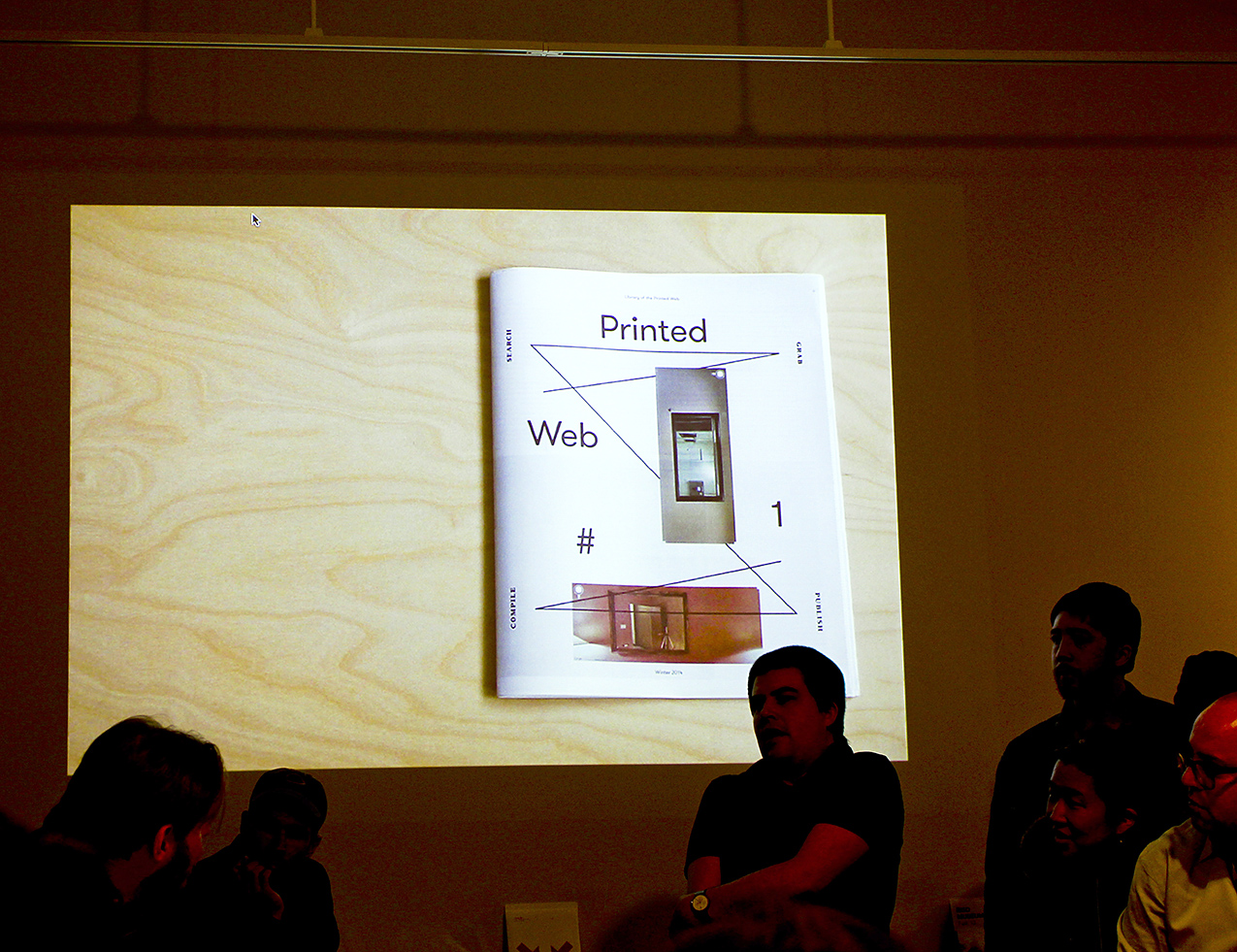
I believe that came from something Clement [Valla] said, a quote that he has about his work with Google Earth. He says he was pulling his images out to archive them and pause them from the update cycle. So the idea of accelerating the image, which Hito Steyerl talks about in the essay Printed Web #1, accelerating the image as a way of circulating it and circulationism in image economy. And then the power we have to then selectively take form that and what is the nature of that. Is it a slowing down? Is it a pausing? The way we circulate images and things now is getting fast and not just faster but constantly updating and changing. So when Clement talks about the update cycle, he’s talking about algorithmic processes that are going in and automatically refreshing and smoothing out. I think about what smoothing out of the digital landscape constantly. That’s one way to look at it—of course there are others?
Regarding smoothing out—not just literally but more about refining and perfecting content?
Yeah, like mainstream interface design when you look at the trajectory of something like Google Maps and it the bumpiness, clunkiness of the interface and where it’s gone with each update. Faster, smoother, easier, that’s the path. So anything we find along the way when we interact with this data is going to be temporal and time based. So the idea that one could take a slice through some area of the internet, or lets say through culture through the lens of the browser/screen interests me, and I do believe that the Library of the Printed Web is that, and the artists that I’m interested in are artists or designers who are doing that in some way. Even unconsciously doing that. Somebody’s interested in playing with this kind of content they may not be thinking about pausing anything, or taking a slice through anything but that is in effect what’s happening. I mean something like Wikipedia, this sort of liquid—I think of it as a liquid—liquid in buckets sloshing around. So just the ability to take a screen capture can be a political move, a social move. That’s why I go back to gesture and technique. As opposed to project. What is the agency that the artist has today, what is the implication of taking a screen grab? When we think about things like Wikileaks and Aaron Swartz and other activist moves that involve data and downloading that’s sort of the other flip-side of this. There are artists, activists, there’s political motives where the action you perform on data becomes the thing that can ignite, can upset, can disturb, disrupt. Less about “it” and more about an action. That’s also why I am interested in Metahaven. They did a big proposal to redesign the Wikileaks logo and that became more of a discussion than resulting in a thing, but the way they went about it and what that meant to them as designers and graphic design in general I think its really important because here’s a thing that is not a traditional commission by any definition, it’s not commercial, it’s sort of this thing floating out there that they’ve defined. But it is also reacting to a specific problem and need; it’s not a vanity project.
I am wondering where is the Library of the Printed Web headed next conceptually?
I see the Library of Printed Web as a platform for me, and Printed Web #1 was one actionable moment that came out of this platform. So for me that is almost for me than the platform itself. Because you know I am not setting up a research library, its not that this is being set up as a library itself. I would like this to be used more as a tool, but I think that might happen more with a robust web presence; where it could really be used more as a database of this kind of work. But that’s more of a tactic. Conceptually I think it pretty much more of the same. I am starting to think about another kind of actionable moment, which is, how could I both work in some kind of commercial way with Library of the Printed Web, like start a gallery space, but how could I also subvert and work around the idea of the gallery and the art market as an institution. So my idea is to maybe represent not artists, but specific works that are rarely seen or acquired or difficult to acquire. And I have several of these in mind. The idea of representing a work as a single edition, like one thing.
So works that are living on the web but not easy to acquire or discover?
Yes generated on the web, but living in a printed way. Hard to discover, own, possess in any kind of way. Somehow the counter-practice or counter-studio idea is because it is very easy to circulate the image and sometimes really important and you know we could talk about what it means to go viral and things like that, and even that as a political strategy. But the idea of disturbing that or pausing that, a material thing, and all the implications that come along with that is there a way to actually deal in that world? To deal in the circulation of things that come from that world? It’s an idea and it might happen before the end of this year. Printed Web #1 was just that in an accessible, $12 way, and anyone can have it. So it’s actually just another take on that.I don’t know if that’s a conceptual direction, but these are my ideas.
Can you remind me of what your distribution method is, and making this accessible?
It has all been do-it-myself which has been really a challenge
It seems that it could also stand out in a lovely way
Yeah, you know Irma Boom’s book that comes in the little tiny box, I think it’s the same issue. If it were on the shelf it would be flopping around. I really like the newsprint thing and the 64 pages so I’m tempted to do it again, but if I have a good idea I might try to shake it up.
You asked about distribution. I printed 1,000. They were all sitting in my studio; about half of them are gone. So I decided to sell them directly online and just take them around. They originally launched at the LA art book fair so that was good- they got a lot of exposure there.
There’s a great community for it there
Yes, we had double the people this year form when it started. And the one at PS1 is just incredible. I like the fairs, and using them as a way to mark a deadline and create a schedule.
And having that community must be nice.
Yeah it’s really great.
My last question is what advice would you offer our class as we embark on printing our HTML projects?
I’m more interested in knowing what you guys are thinking about, and that could help.
Right now we are assembling our projects and written content such as interviews, some code snippets and we are working in teams on different aspects. There is a browser to print direction.
Here’s one idea, on the one hand a lot of the artist in the Printed Web #1, are artists who are, like Kenneth Goldsmith and his Printing Out the Internet tumblr project, literally just printing stuff out, and he came to my studio and was going through every work in the library, he loves the project, and he talked about the “dumbness” of some of the projects and there’s a kind of dumbness when a book just prints out from a data feed or an API for 3 days or something. Or the dumbness in a sweeping gesture and just dumping it into the page, into a format. I love what we can call dumbness or transparency or literalness. It’s directed; its kind of matter-of-factness. And then there are projects that are less so, that are taking things and re-formatting, re-digesting, re-interpreting for the printed page and those can be interesting as well, but those are more designed projects. You know in the sense that I’m going to design a book and I’m going to take from the web. Maybe those are two distinct approaches that you could be thinking about.
So I think there’s something exciting about saying our publication is this web presence, or this page like the idea of one gigantic tumblr, and here’s one instance of the printout and you print a stack and set it on a table. That to me would be an exciting proposition because you’re denying its sort of bookness, by making it about the printing and the paper and the output and maybe there’s more connection to where it’s from.
Another way to say this is that any movement from one medium to another is a translation and so to what extent to you highlight the translation or not. Either of those directions would imply different things.
I was thinking about that with printed web work in general—that it could easily not be obvious enough that it is from the web, and a viewer just think its an interesting design.
Yes, and I purposely kept the explanations short and confined in Printed Web #1. My original idea was to not have anything at all, just the title and the work, no back matter or front matter because Seth Siegelaub’s Xerox book was just like that: seven names, his names, the date and then the work. Again, it’s kind of the dumbness factor but then I thought for anyone who’s not going to get it I would add more.
Well thank you, that’s all my questions unless you have anything to add.
No, I’m just excited that these discussions are even happening.
Augustina Bello-Decurnex talks with Kelly Walters
Augustina Bello-Decurnex is a Material and Textile designer based in Boston. She is a native of Uruguay and studied as an industrial designer in textiles and fashion in Montevideo before coming to the United States. In 2013, she graduated from RISD with her MFA in Textiles. Her work explores the connection between 3D modeling, industrial design, creative programming in conjunction with traditional textile techniques. Augustina is currently a Material Innovation Designer at Converse.
My name is Kelly and I’m a graphic design grad here at RISD. Some of the areas that I have been looking at recently are the relationship between textiles and graphic design. Looking to you in terms of inspiration because of your textiles background, I was curious to hear a little bit more about how you ended up in the field.
I definitely had a winding road. I don’t even know how I got into textiles, well I know, but it definitely wasn’t an A to B road. In my undergrad I started as an industrial designer and I didn’t enjoy the programs. I felt like it really wasn’t loose enough for me, so I went into textiles and fashion but in Uruguay … The textiles and fashion teachers there, were more influenced by theater and set design. They were half artists, half designers … So when I finished undergrad, I was totally done with textiles and fashion. It was then that I started working as an industrial designer for a couple of years. I also worked as a constume assistant, and then did two years working as a graphic designer, at that point becuase I was confused! I realized that I really liked printing and that it was a combination of all of my interests. It’s in-between graphic design and textile design and industrial design … I’ve never been a traditional designer in a sense. And actually I talked about this in my lecture to the textile students here at RISD from a few days ago. I’ve never been a specific kind of designer. I don’t know, I’ve always enjoyed the space in between things.
I knew that I wanted to come to grad school and loved the textiles program here at RISD. At the time, I was also doing more and more material development for people and I wanted to go to a program that would allow me to explore that further. When I got here I started working with knits because I had done a lot of printing. … I’m sorry if this is a lot.
No, this is good. This gets me familiar with what you’re into!
My dad is an engineer and my mom is a cooking teacher. Growing up I’ve always had this mixture of very rational/logic thinking and artistic thinking … I’ve always been someone who has been into science and art. Textiles has that kind of combination because you’re using machines, you’re using structure, its very logical and technological also because of the combination of all of these components. I think as a textile designer, you learn how to use different textile machinery so you can ultimately transcend the machine to express your own language as a designer. As a printer, I started to ask myself “What is my identity?” as a knit designer. The answer happened very organically. I discovered and started working a lot with Thermal Plastics because I was working with a heat press and mastering the very technical aspect of knitting. I knew how to weave and make all of these structures, but how can it stop being about the technique and technology and more about the expressive quality … My work deals alot with identity and coming to terms with South American and moving to the United States.
From growing up in this place (Uruguay), its like ummm … Have you read any magical realism?
No. What is that?
So in literature its writers like Gabriel Garcia Marquez or Carlos Fuentes. For people that are not from South America its sounds like super weird things start to happen and it makes no sense and appears to be total fantasy. But the funny thing is that, I come from very real place where those things are not fantasy. It actually happens. For example, in my undergrad school there used to be a jail from the late 1800s and it still looked like a jail when I went to school there. At one point part of the school and the jail were functioning at the same time. One day, before I came to the school, a famous murderer escaped from jail through the printshop.
Wow. That’s crazy.
I have the craziest storiest from that time and so my work has always dealt with those kinds of things. Tricking the person that’s looking at something. How can you have those different layers and weird juxtapositions? It’s a lot about magic and transformations, and how those situations can shift from one thing to another. So my knits are actually in between other things. I was thinking a lot about materiality and immateriality. I was 3D rendering knits and using interactive embroidery and arduino.
So talking about that, with arduino and interactive means to influence your process, how did you explore that, and how did it shape the work? For example, with arduino you have to use code, I’m curious how that came about?
If you think about textiles, we’re always coding something. It’s like you’re coding the machines that you’re using. Actually, computers developed from textile languages. The first computer was a Jacquard Loom. So we, as textile designers, are already used to this structure. You have a very logical structure, and then you add materials and color and that’s your way of adding an expressive component to the mix. So if you look at my work, people that always ask me how did you make that. I feel like the process stops being as important and becomes more about a means to an end. For me coding is an analogy to any other textile processes.
The same way of making as something else?
Yes, its exactly the same. If you look at how someone programs a Jacquard loom or how someone programs a sewing machine, the techniques they are using are basically CNC driven. Instead of cutting, the machines work with yarn. Even in the industry when I try to explain what CNC knitting machine is, when I finish explaining it they’re like,“Oh so it’s like a 3D Printer with yarn.” You don’t use Rhino to program, you use a different program and its program to make it program on its own. This type of programming essentially uses just ones and zeros. The origin of the ones and zeros came from the Jacquard Loom. You can see a picture at the Textiles Department because they used to have one of those here. The first computer started with perforated cards … It all started with textiles. {Augustina’s RHINO Knits}
I mean it is different because you’re using electronics, but the programming and the coding part is the least foreign thing to the process.
Its funny because I feel like, the impression or the stereoptype of textiles and what people perceive is the process, includes misconceptions around hand knitting and physically printed objects.
I feel like that’s the difference between industrial textiles and crafts. There are textiles that deal with structure, like weaving and knitting and you have printing … that’s closer to painting. Structure is actually very logical and there are things that you can do and things that you can not do.
And because its based on a structure to help output at the end.
Not even, it is structure on its own. Weaving its a good example, where you have one yard on top and another on the bottom. This formation is basically like one and zero. That’s where it all came from. Its already binary.
So since its binary, its already in code form?
Yes, and thats how we work. That’s why when people ask me alot about technology and how it influences textiles. There are a lot of people that don’t work this way, but in the way I work its not about innovation and its not about the machinery. Everything we do involves machines, so usually we try not to be gimcky about it … The conversation when its interesting is about what is the expressive quality or manufacturing method …
So primarily you’ve used Arduino, but have you ever explored HTML or coding online?
Because I studied graphic design prior to becoming a texile designer. I learned HTML, Dreamweaver and did mainly web work for about 2 years. I learned how to code in Flash and it horrible and I hated it … I still remember CSS and how to edit all of those things. I do my own website … I think coding for me its not something that’s scary anymore. And also, I had an amazing teacher here. I took an independent study with Lauren McCarthy from Digital Media … I learned a lot from her about Arduino. So I think now working with coding and these more computational aspects is like learning how to learn. Because it always evolves and its always changing and you always have to learn to keep up with the changes.
Now you’re working at Converse. How did you end up there? How has you process evolved in your professional practice?
I knew that I wanted to work in innovation and I am a material designer. I mean I am a textile designer but but I consider myself a material designer.
A material designer would mean … ? The actually physical quality?
Its a bit beyond the textile itself. I’m designing experiences and I think that might be my industrial design background, but I’m interested in the relationship of the material with the consumer. The experience that someone gets between the material and the end product and what’s the relationship with material to the manufacturing.
How are you incorporating these techniques in your professional practice at the Material Innovation Department at Converse?
The thing with Converse, is that we have a really exciting projects. I’m basically working for creative people, so I can relate to them. Its very open. Its a fashion brand and its an iconic product. It’s a heritage brand that has a personality. The spirit of the brand is a lot about hacking technology and humanizing technology. I don’t know, I’ve bet that you’ve worn Converse sneakers once before?
Yes, I do. Yeah, and its probably all about pushing the brand forward to explore new ways of being seen by consumers.
Yes, but Converse shoes are never going to feel like spaceships. Because that’s not what the brand is about. People have that special, very personal relationship with them. I used to work in the denim industry before and I feel the relationship that you have your converse shoes, especially the Chuck Taylors is kind of the same that you have with your jeans. That its something that ages and grows with you. Kid consumers are an example of how they continue to wear the shoes and duck tape them after they’ve fallen apart and break. Its very grungy, very young.
It’s been really nice because I’ve been able to maintain my spirit with how I relate to technology. It’s become more of, how do I hack things, how do things become more human, even though it’s very technological, how do they become closer to you. It’s more of an experience.
I think that it’s also all about the processes and not getting stuck. And thinking about how they mean something too, right? As you’re making it just gets to a point where it just feels right and you’re making these things flow from one place to the other. And, does it make sense? Or is the gimick that outputs something that you can make something move? That’s definitely something that I’ve been thinking a lot about. I feel like the meaningful work comes from the reason behind using that process.
There’s something about textiles that makes you feel so comfortable because you’re surrounded by them, yet sometimes coding feels so foreign. So as a designer exploring, how do you make sense of those two worlds. Why are you mixing those two things together? What are you getting out of it? These are the questions I keep asking myself all the time. If you keep on asking these questions and it still makes sense then you’re going in the right direction … I don’t know I’ve always that kind of approach. Maybe its my weird South American brain.
Noo. I love when people have their own flavor and bring it into their work because it influences things and shakes things up. We do get used to processes and seeing form in a certain way and thinking that that’s all there is. So I think its cool to be informed by all of these things that are happening around us to help shape how we make. Because it’s the only way we continue to move forward and do things that haven’t been done before. What do you think the future of textile design will be like with the integration of these digital techniques?
The computer is just another tool. It’s just another machine. It’s about how you use the tool to make it become personal again. Because it can become so generic and removed. The work can be done by minions. But I think that people are really craving for that. Because technology today is a given.
I don’t know. That’s my two cents on it.
Armand Mevis talks with John Caserta & Dylan Fracareta
Armand Mevis is a Dutch designer and on faculty at the Werkplaats Typografie and Yale University. Dylan Fracareta is the design director of Pin-Up Magazine and on faculty at RISD.
I am interested in using the web browser as the primary tool to produce “traditional” design objects. Traditional being in quotations because you could still have a digital permutation, like a digital media wall at a train station, or the Lust Poster Wall, etc. But the idea that it all comes from the browser, but is not consumed in the browser. No Adobe InDesign or Illustrator. The reason I got interested in this was by teaching Web coding. I found the best way to teach this stuff was by having students create abstract shapes. No content, no type, no images, just shapes. They would need to make compositions with those shapes. In doing that, the Web Inspector — which is part of the browser — you can go in there and play with numbers. And it adjusts the display in real time. So without moving a mouse, you’re designing. By typing in numbers, and moving the cursor up and down. The intention would be to make some formal prompts. If you’re a designer you tend to respond to things in front of you. The assumption with coding is that you’re typing in words and you turn to the left, and almost like a laser printer, out comes the result. The reality with programming now is that it’s more like adjusting two sheets of transparent paper: you can see whether you like this or don’t like that. The gyst of the conversation today is about the tools in which we use to make things. To talk about books and publishing, PageMaker, QuarkXPress and InDesign have become a standard. The codex has been around for a thousand years, so it’s clear that we don’t need that software to make books. I’d like to get at what happens in the brain in using this software. Where does the pleasure lie in making books. When is the moment that you realize it’s the thing you want? How do the tools play into that? How do we make the things we like? What part do the tools have in that?
If I have to think about a book, it’s actually not even about using the computer. It’s just something that happens in the mind. You try to imagine a certain kind of book. You start to define it in terms of its physicality without having the ability to see it directly. You start to think about a specific form, you start to think about specific paper, you start to think about a certain kind of binding, without having the ability to immediately make it. I try to imagine it, then I try to describe it for a binder. I start to order paper, I start to say what he needs to do. There is a gap in time of about two weeks between what you described and when you get it back. That for me is making the book. The part where you start using the computer is more like finishing it.
There is a built in structure to InDesign as far as pages and where content goes. There are many ways to achieve a bad result. Like you can’t see something or it’s not there. There is something about the browser that is much looser. As long as you don’t do something silly, it’ll all be there. And you can always be reacting to the thing that’s there.
That I think is very positive. Often people start with a 12-column grid. Because you can get 4, 3, etc off that. Already you have a dull grid. It’s dangerous because in that way because you have a pre-emptive structure. At this point, my grid is just different units. I do everything with the move tool. I just put in a number. It all moves in zones. I don’t align things to the lines physically. I multiply it by 3 or 5. It’s all step and repeat or the move tool.
Armand, because your work is so freeing, vibrant and experiential, have you ever thought of designing for the screen. Is there any way in which you work in terms of imagination or the physical book can translate into the Web?
I have a hard timing fantasizing about the Web as a place to make work. It has not even to do a lot to do with the fact that I cannot program, because you don’t have to be able to program. But to think digitally, in my head somehow, doesn’t happen yet. But, I’m very intrigued by it. I see also that this is where it goes to. When I think about the MCA [Chicago] assignment, we brought Thomas Salizna, a web designer, and we make him a part of the team, so we are working on it the three of us. So we want to make the bridge between the Web and print much smaller. Perhaps what you are trying to do with your students. I can see how wall labels can be spit out of the computer. So there is this one place where all this information is already there, so you can start to think about “what do you print.” They call communcation “publishing” in the Museum. Which I think is a nice word because it doesn’t make a distinction between print and digital. A website can deliver many things at the same time. We are used to reading a lot of different things on a website: contact information, what shows are there, etc.. When you talk about print, like a poster, it delivers only a single message. We are interested, in print, in sending several messages out, which is much more web-based thinking. The web is inspirational, but I’m very much thinking in print. Print is different. When you make a poster with four messages at the same time, [people] are confused, they don’t understanding it anymore. On the web, we don’t get lost. We can handle much more information at the same time on the web. When I look at my screen, I have four windows up, and I don’t mind. I have it all up at the same time.
I’m also highly frustrated about websites. For instance the website of the Stedelijk Museum, there are things that you want, but they are impossible to get, because there are other companies in between. They use a CMS system, which is free, but is limited. So to build in new templates it costs a lot of money, and they can’t pay for new templates. Websites — it seems as if you can do anything — but you cannot. A website is much more of a machine, which is an interesting aspect. It has the limitations of a machine. If it doesn’t fit here, then that moves there. You hardly have any control. You get these things that are super ugly. It is very limited.
Do you see a split in terms of what designers are doing?
I can at least say, that it is more accepted that you can be very experimental. But whenver we have meetings which are about websites, it is superconventional. It’s always about “where is the menu, where is the bar.” It is already so very defined. It’s very difficult to change that, I think. In book design, people are more open to surprising and different solutions.
What I think is interesting is to question things all the time. To question existing solutions. To have the ability to questions things, to come up with alternatives, to experiment. That’s the fun part. For websites, the idea of experimention is very limited. Perhaps for technical reasons. It takes away the pleasure.
In most of the things I’m designing, you’re telling a richer story than just reading. You get a bigger umbrella. In news sites you don’t need the bigger thing. Then you longer have navigation that is top bar, etc.
Is it a different type of student that works in the web space?
I noticed more students here that are interested in programming than what we have. Maybe it has to do with the students we choose. But it’s nice for me to see so many students who have so many ideas in the digital space and how they think about it. There is a lot of potential if you think of digital and websites and print.
I don’t see a split between digital designer and print designer. Now I need to collaborate with a developer to make it. I won’t be facile enough with developing. It’s much better to work with them. You can’t do everything at this point.
The person who can visualize and create an abstract mark seems to be different than someone who can design a web kiosk. Is it the difference between draughtsmanship and drawing and art? And there are those who can take a ton of information, like Ben Fry, and reduce it down. It’s amazing to me that we all call them the same thing. The web tends to bring out this issue.
Students today are raised in a completely different way. The access all their information digitally. I think for them it’s much harder to relate to physical things like a book. Especially when I think of my own son, who is 10. He doesn’t live any more in the real world, he lives in some kind of digital world -- with the games, and the information. He immediately jumps to the computer to find information. This kind of generation will think completely different about the things that we talk about, like books. Perhaps more in the way you talk about: the browser is the main thing, the book is secondary.
Maybe 10 years ago it was different, and so too our conversation in 10 years time. When we are more adapting these things to merge. How does it affect your practice and the world of communication. It’s nice to be a pioneer there.
Have you thought what your practice will be like in 10 years?
It’s hard to predict. This notion of the digital space. It’s already very different than 4 years ago. We were thinking more in a traditional way. We were thinking in our world, and then there was also a website to be done. Now we are already thinking to put the digital part much more in the forefront. That’s already very different. So in 10 years time, I don’t know if we will still be talking about print. It raises a lot of questions, like the idea of a logo — something like the mark. On a website, it’s not so important. Traditionally, it is still very important. So the question is when you would experience and see the mark? When would you have a physical interaction with this thing that you made. That is changing. The notion of the hierarchy of the mark and everything is below. Now, it is the other way around. We have the pyramid where the bottom is on top, the digital space. The mark is at bottom and is some sort of output.
Lukas WinklerPrins
Lukas WinklerPrins / I found that almost all of my work is guided by the question “what is a piece of browser-native media?” This started with kinetic patterns, taking advantage of the infinitely long, interactive canvas of the browser window. The pages explore user-animated and curated form generation through the intuitive gesture of scrolling in a web browser.
Ojus Doshi
Ojus Doshi / Using CSS, I have attempted to transform typography into a pictorial, graphic, and illustrative form that evokes an abstract landscape.
John Caserta
John Caserta / Repeating patterns made of div tags. Created primarily for the joy of creating pattern in the Web Inspector of Chrome. Intended for wallpaper, digital displays and textiles. See the HTML.
Daniel Giuditta
Daniel Giuditta / The era of image sprite sheets has just about ended. Websites like Google and Facebook are served many millions of times per day. The contents of the webpage have to be sent from the server to your computer, and each time the 'client' and the server communicate its costs a fraction of a penny. CSS sprite sheets are large image maps masked out by divs. They can be manually revealed by isolating the element in web inspector, expanding the width and height of the parent div so that the frame around the sprite sheet no longer masked out a single icon. In some cases I had to move the background positioning to 0,0 so that the image was centered in the now expanded parent frame. In contrast to the Content Stripper which showed a webpage at its most minimal, manually revealing sprite sheets created a texture of density on familiar sites. Revealing the sprite sheets shows the hidden structure of Facebook — the Facebook that's always there but we never see.
Michael McDermott & Ojus Doshi
Michael McDermott & Ojus Doshi / The nature of CSS makes the visual form of a website extremely tenuous. One small CSS change can render a well known website unrecognizable, thereby creating new visual form and revealing the underlying structure of the site. Our explorations insert a few lines of CSS into common websites like Google, Facebook, & Yahoo via a manipulated, open-source Chrome extension called “textfreestyles”. Using a default A2 size page as a frame or cropping tool, we selected interesting compositions for printed output. A2 (16.5" x 23.4"), digitally printed, 2014.
Michael McDermott
Michael McDermott / After working on This is Important, I wanted to continue work that followed along the same guidelines. In that project I altered a website's CSS using the !important feature of CSS and found a page from the resulting PDF I wanted to print. Unlike that project, this project has no curation and prints the entire site out on letter sized paper. I chose the main page of Facebook after you log in because it is a site that is widely recognizable and is based on reading and images. To alter the site I added this to the CSS using Chrome’s web inspector menu.
Those three changes made all the text black, the font size 1000px, and the letter spacing 1em and created an almost 1500 page book. That changed a single page website into an entirely new thing both in digital form which is show in the first several images and in the printed form which are all the other images.
Volume I, 740 pages & Volume II, 730 pages (8.5 in x 11 in), printed by Lulu, RISD 2014
Christina Webb
Christina Webb / This series of patterns uses CSS to manipulate divs into specific, repetitive forms resulting in patterns. Color, opacity, position, and overlap are carefully applied to create vibrant color relationships and add depth to otherwise flat forms.
Philippe Cao
Philippe Cao / A series of exercises exploring color and form as rendered by the Google Chrome browser. See the project.
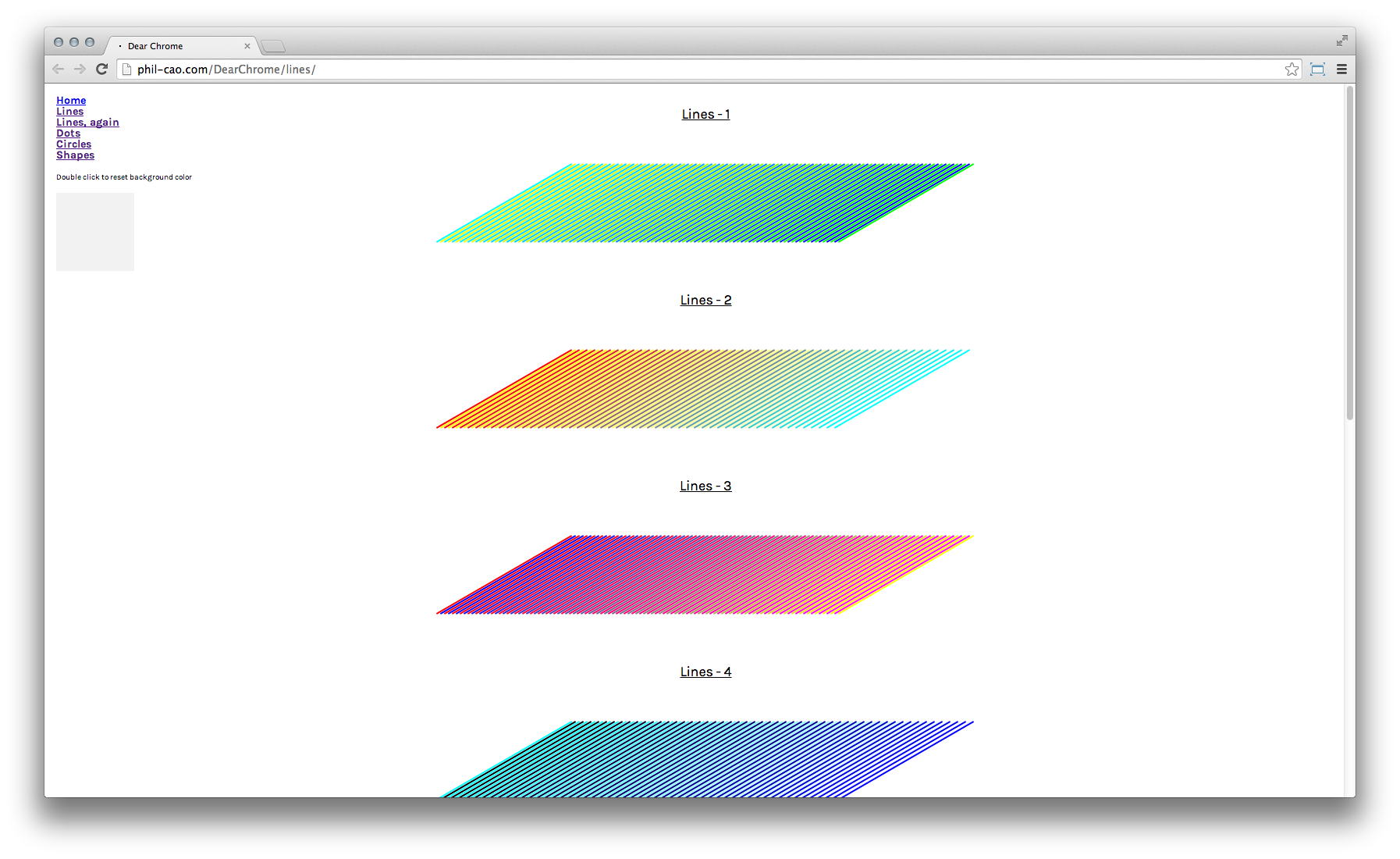
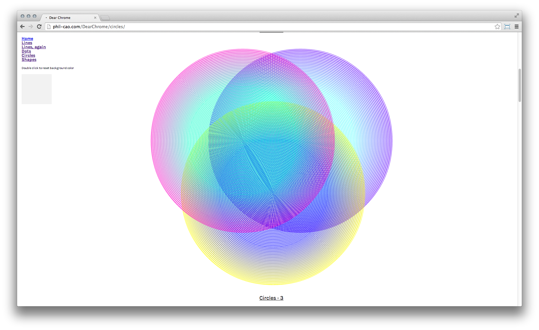
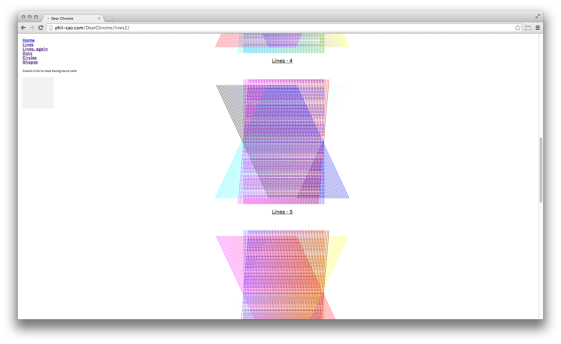
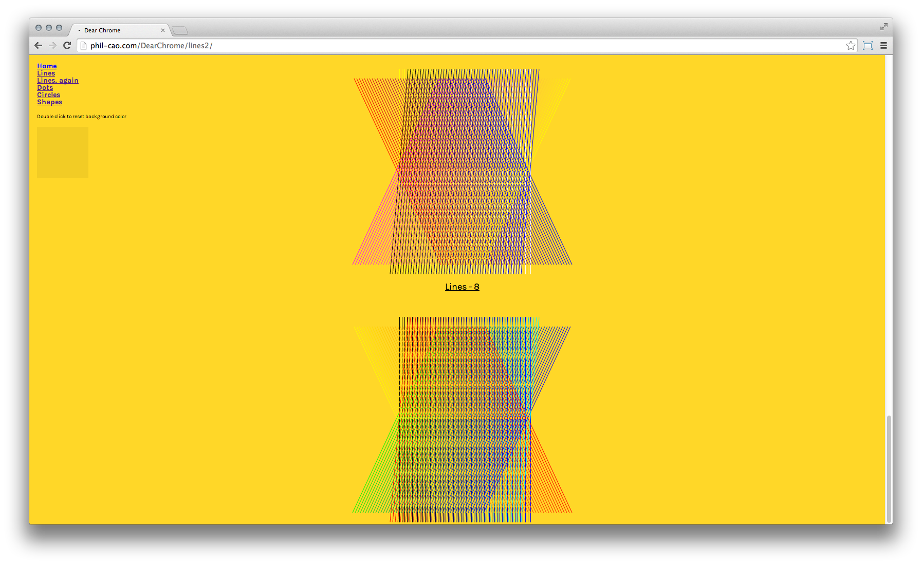
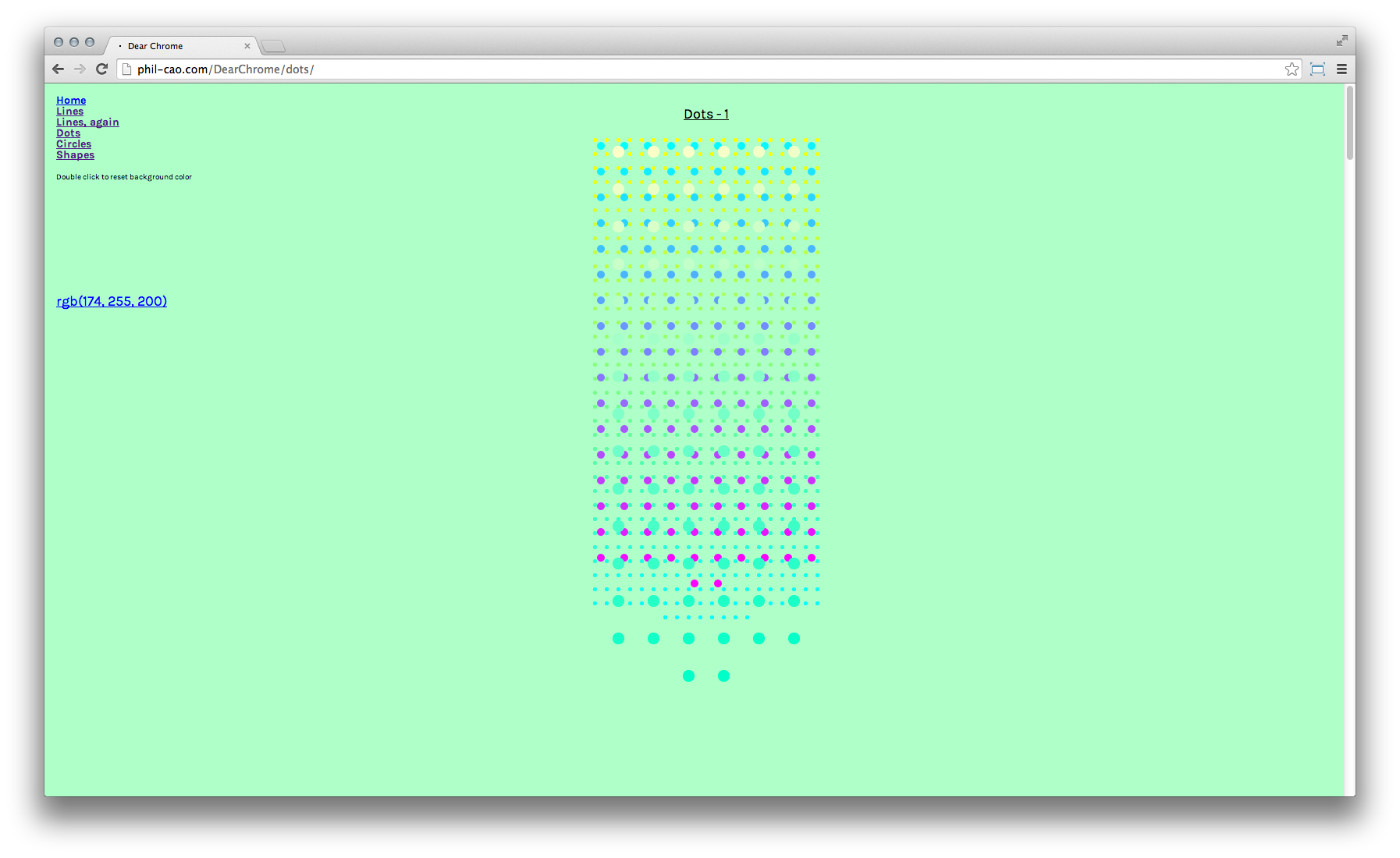
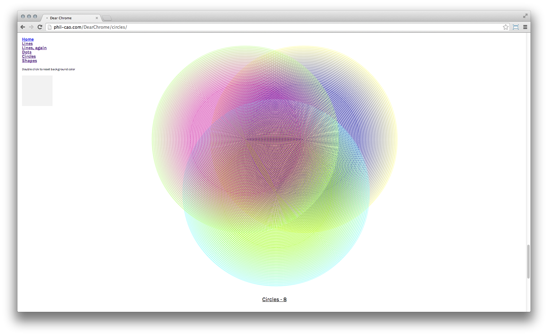
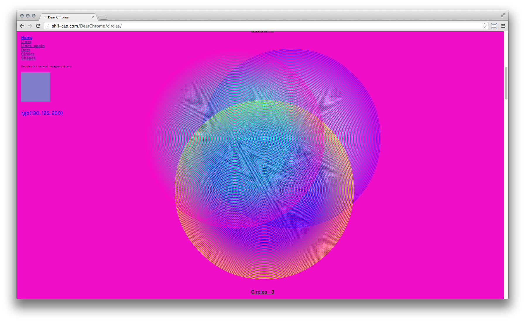
Kelly Walters
Kelly Walters / Experiments in pattern and overprinting techniques
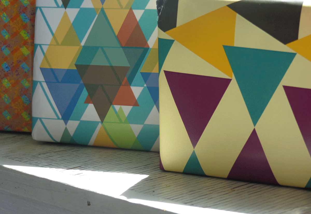
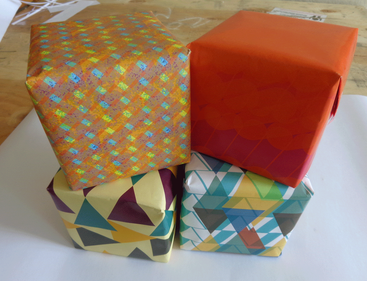
Christina Rees
Christina Rees / Animations using HTML keyframes. Best viewed in the browser.
Evan Brooks
Bindery.js / Bindery.js is a set of libraries and snippets to design a print-ready book in the web browser. It’s an attempt to understand and rethink the proprietary process and tools that define the modern book. It's also an ill-advised and needlessly complex foray into the expectations, standards, and priorities that define how web browsers work. / Evan Brooks
The library provides a bare-bones structure to perform operations on the book content. A snippet of code may perform operations on the whole continuous text, or on a page-by-page level, or both. This gives us a way to think about how a book is processed.
Our effort in writing bindery.js is an exercise in deliberately misusing software. At times it was also an exercise in futility, as our idea about what a book should be lead only to long-abandoned forum posts and bug reports from 2007, a forgotten time in which some still believed that ordinary people wanted to hold in their hands a printed-out piece of paper from their browser.
But despite the rough edges, it’s become a truly useful framework for thinking about the book and the patterns and repetition that shape it.
When you grow up with Adobe InDesign, you take for granted the ability to flow text across boxes and pages — it’s the only way to design a layout for a book or magazine. In 2011, Adobe's Web Platform Team proposed bringing that concept to the web, both as a standard for all browsers and as actual working code, contributed to the Webkit project (at the time overseen by Apple and Google). The design and tech worlds were pleased— Adobe, the behemoth of design software, once so proprietary and inscrutable, was opening up and engaging with the web and technology in a new way.
Three years later, Google ripped the code for CSS regions out of Chrome, arguing that their priority was how fast the web was, not how ‘rich’ the content was. The father of CSS himself condemned the CSS Regions spec as “harmful” to the web. He argued that it needlessly confused the distinction between 'content,’ the role of HTML, and ‘presentation,’ the role of CSS. A designer might argue that the distinction is somewhat arbitrary, but in the community of the web, semantic meaning comes mostly from assigning bits of text labels like ‘paragraph’ or ‘pullquote.’
It’s a reminder that even though a browser is ‘open source’ and open to contributions, the work that gets done usually benefits Google. The CSS Paged Media standard from 2008 remains missing, as Google builds features to draw 3d graphics and hook up to webcams and build mobile apps. And it’s notoriously tricky to show a new advertisement once you've printed the web page out (in fact, print preview mode is actually a great way to strip irritating ads, breaks, and sidebars from a news article).
Evan Brooks
Loom / Loom is an experimental text editor that is closely integrated with a web server. It's built on the assumption that the smallest possible web site is not simply a line of HTML, but a line of HTML on a web server. Just like you can't open an InDesign document without creating a 'page' of a book, Loom encourages perhaps the most important property of the web — the diversity of screens and interaction methods that embody a web site. / Evan Brooks
I'm cautious of over-reliance on the browser's built-in web inspector. Although the tools in Google Chrome are perhaps the best out there, they seem to portend a tight integration with a single implementation of web standards, and in doing so weaken the importance of the standards in the first place. It is for this reason that Loom does not include any direct preview within the frame of its window. Unlike more sophisticated software, like the Creative Suite and IDEs, text editors don't claim to bring everything to the table.
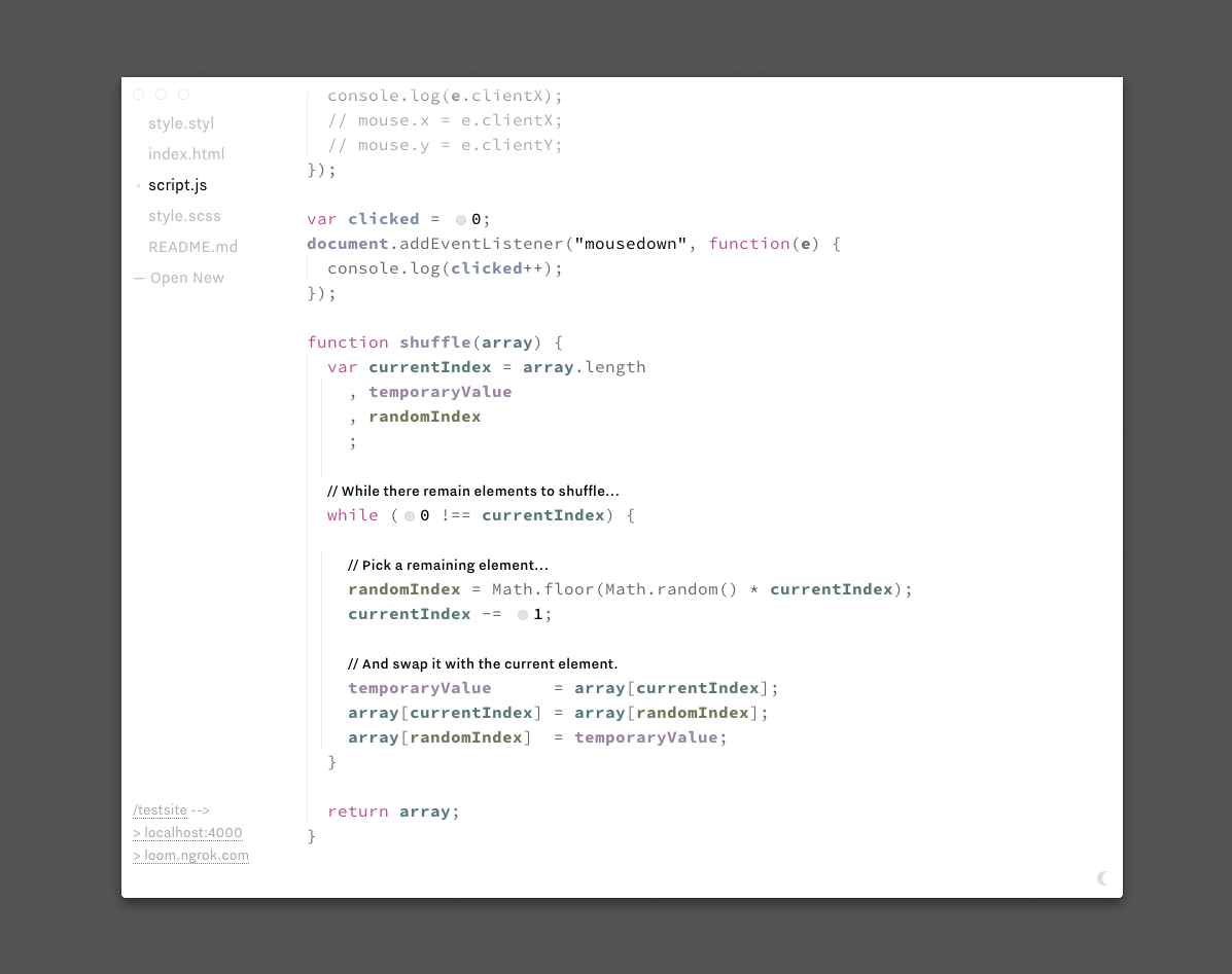
Loom is a live coding environment— changes in Loom appear instantly in all browsers, regardless of how far away they are. While it doesn't obscure or alter the nature of code, numerical parameters can be tweaked fluidly by dragging a slider. Color, too, may be manipulated with a more familiar interface. By not hiding the workings of code behind proprietary abstractions, people who use it can take part in the wide community of people building for the web.
Loom is built using node-webkit, CodeMirror, and socket.io, and takes inspiration from similar open-source projects like Light Table and Brackets.
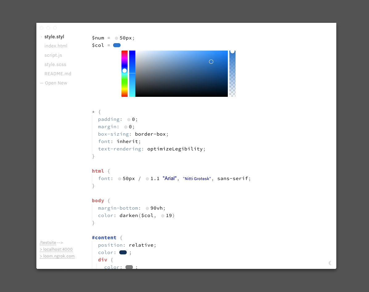
Catherine Schmidt
BabyBrowser / BabyBrowser is a tiny browser written in Java. Using Java's charmingly outdated Swing library, it's essentially a frame that points to a URL. Sometimes it can parse HTML & CSS, and sometimes it can't. BabyBrowser questions the ubiquity and completeness of the web. It highlights the fact that the web as we know it is simply a set of agreed-upon standards. BabyBrowser shows that potentially there are different ways to use and see the internet. / Catherine Schmidt
The following is the code of BabyBrowser in full. Please, try this at home.
Lukas WinklerPrins
Print.js / I returned to the patterns that many people had been making for this class—my kinetic patterns, Daniel's stock element creations, John's repeats, Catherine's typographic layerings. I went about trying to print these. "print.js" is a file that, in theory, you can simply put into the end of your head tag and it will create an @media print{} style sheet that translates your screen output into something printable. With it, one can easily specify paper output size that crops the pattern before printing. / Lukas WinklerPrins
There are some best practices for formatting:
1. All javascript must be in the head or external file. None in the body. Use jquery!
2. Put print.js at the very end of your head.
3. The outside div should be called either “wrapper” or “container,” otherwise it will assume it is a structural div rather than big wrapper.
4. Structure goes body > “wrapper” > container divs > pattern divs.
5. Write your CSS in a tag rather than on a separate .css file.
6. Requires a tag at beginning, to find page height.
Below is the javascript. At top, you input paper width and length, and the unit you used. You can also view the source here.
To install, simply save the above in your directory as “print.js”. Then, put the following two lines into your html page:
print.js works best in Safari